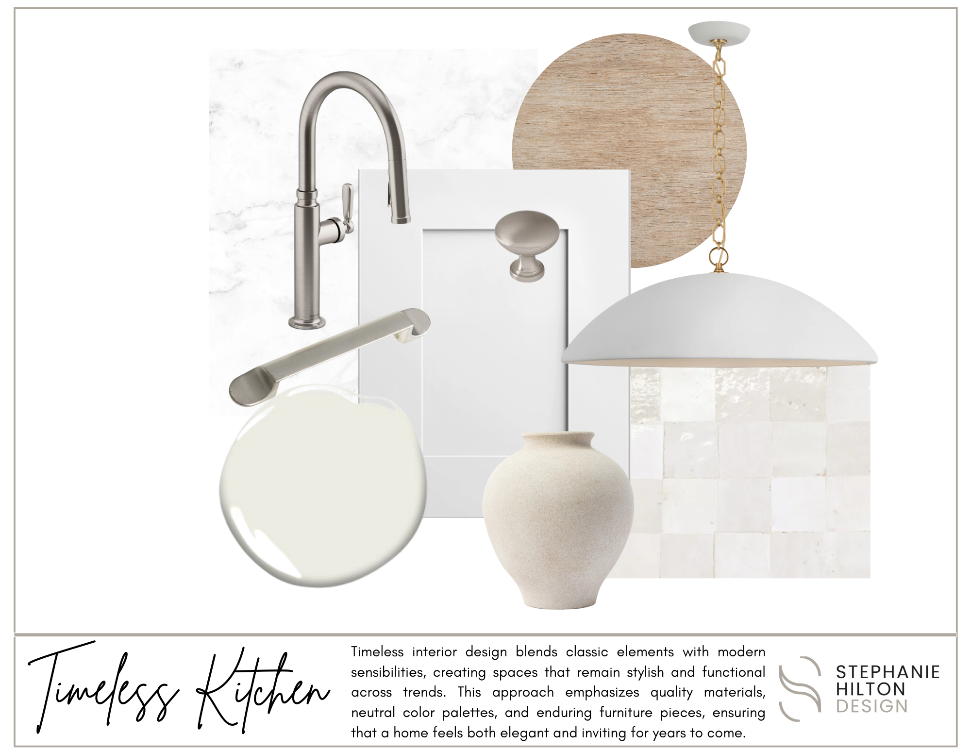
Creating a timeless kitchen involves a blend of classic design elements and functional practicality. Start by choosing a neutral color palette for walls and cabinetry, which provides a versatile backdrop for various styles. Incorporate high-quality materials like marble countertops, hardwood floors, and durable fixtures that stand the test of time. Opt for traditional cabinetry styles, such as Shaker or beadboard, which offer both charm and functionality. Layer in lighting with a mix of ambient, task, and accent options to enhance the space’s warmth and usability. Finally, keep decor simple and understated, allowing for easy updates ensuring your kitchen remains stylish and inviting for years to come.
5 MATERIALS TO USE IN A TIMELESS KITCHEN:
Marble: This luxurious stone adds elegance and sophistication, making it ideal for countertops and backsplashes.
Hardwood: Rich, warm hardwood floors bring warmth and character, while also offering durability and easy maintenance.
Stainless Steel: Durable and sleek, stainless steel appliances and fixtures provide a modern touch without compromising a classic aesthetic.
Shaker-Style Cabinets: Simple and functional, Shaker cabinets in painted or natural wood finishes offer a timeless look that pairs well with various styles.
Subway Tile: Classic white or colored subway tiles are versatile for backsplashes, providing a clean, understated look that complements any design scheme.
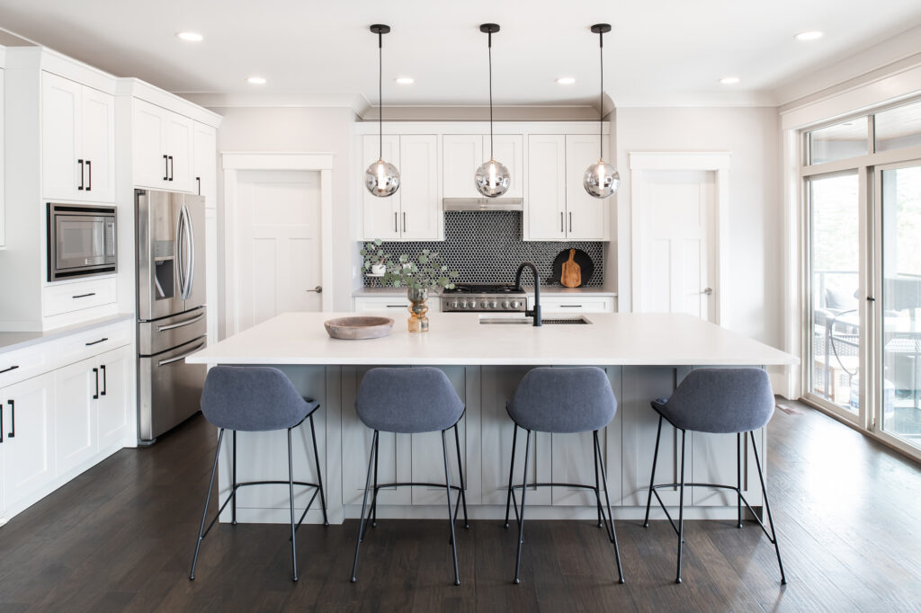
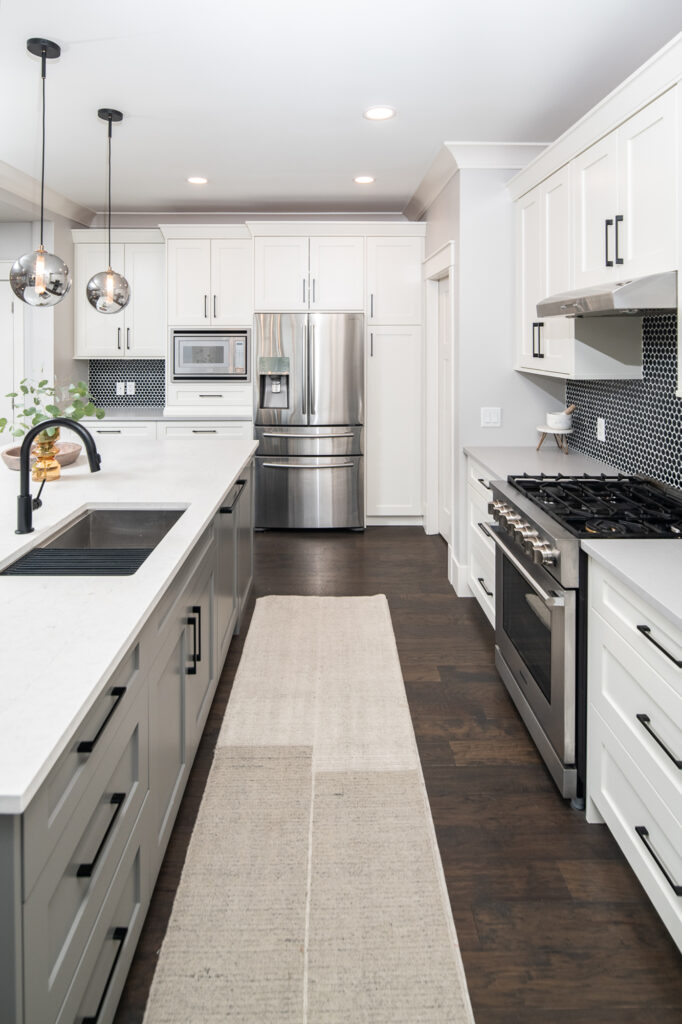
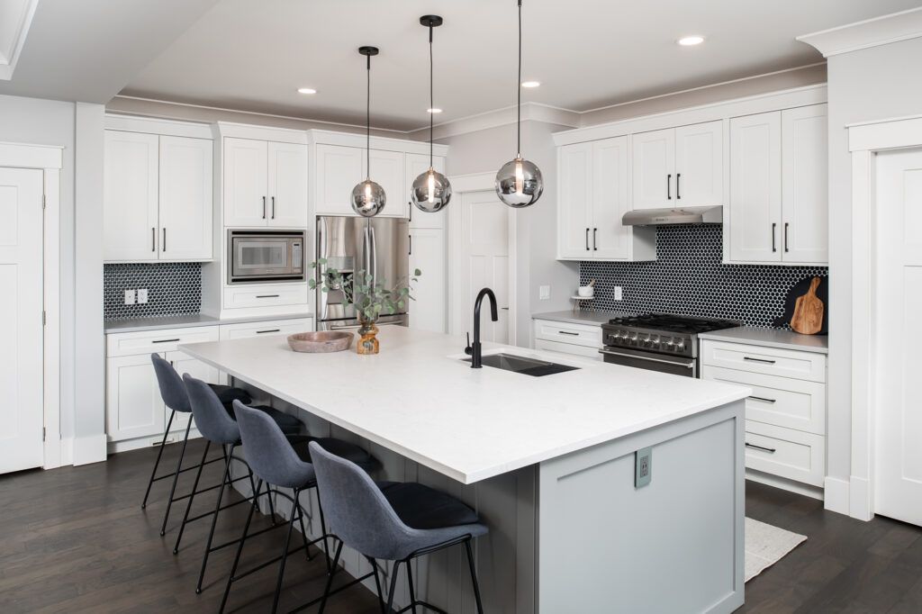
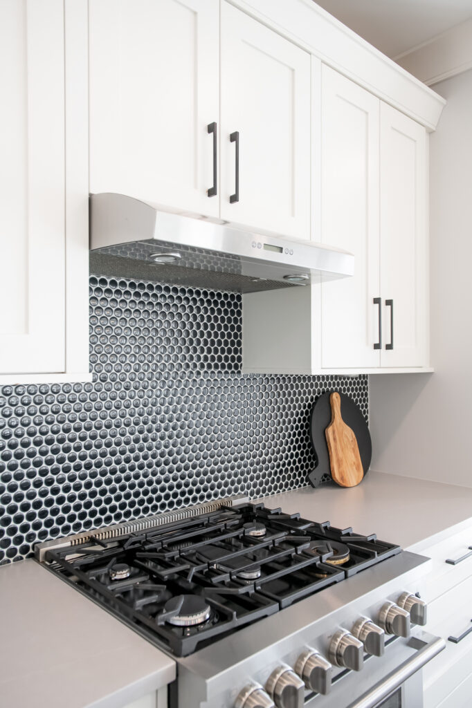
This kitchen we designed reflects timelesss design with added bold accents such as black fixtures & hardware, and classic penny tile backsplash to add colour to the otherwise neutral shaker kitchen.
Neutral paint colors are ideal for a timeless kitchen because they create a versatile backdrop that enhances the room's overall design without overwhelming it. These hues, such as whites, grays, and beiges, promote a sense of calm and spaciousness, making it easier to incorporate various styles and decor elements over time. Additionally, neutral colors allow for easy updates through accessories and accents, ensuring the kitchen remains stylish and relevant as trends change. This enduring palette also highlights architectural features and high-quality materials, reinforcing a classic, sophisticated aesthetic.
If you need helping planning your next design project, please reach out. I’d love to discuss it with you!
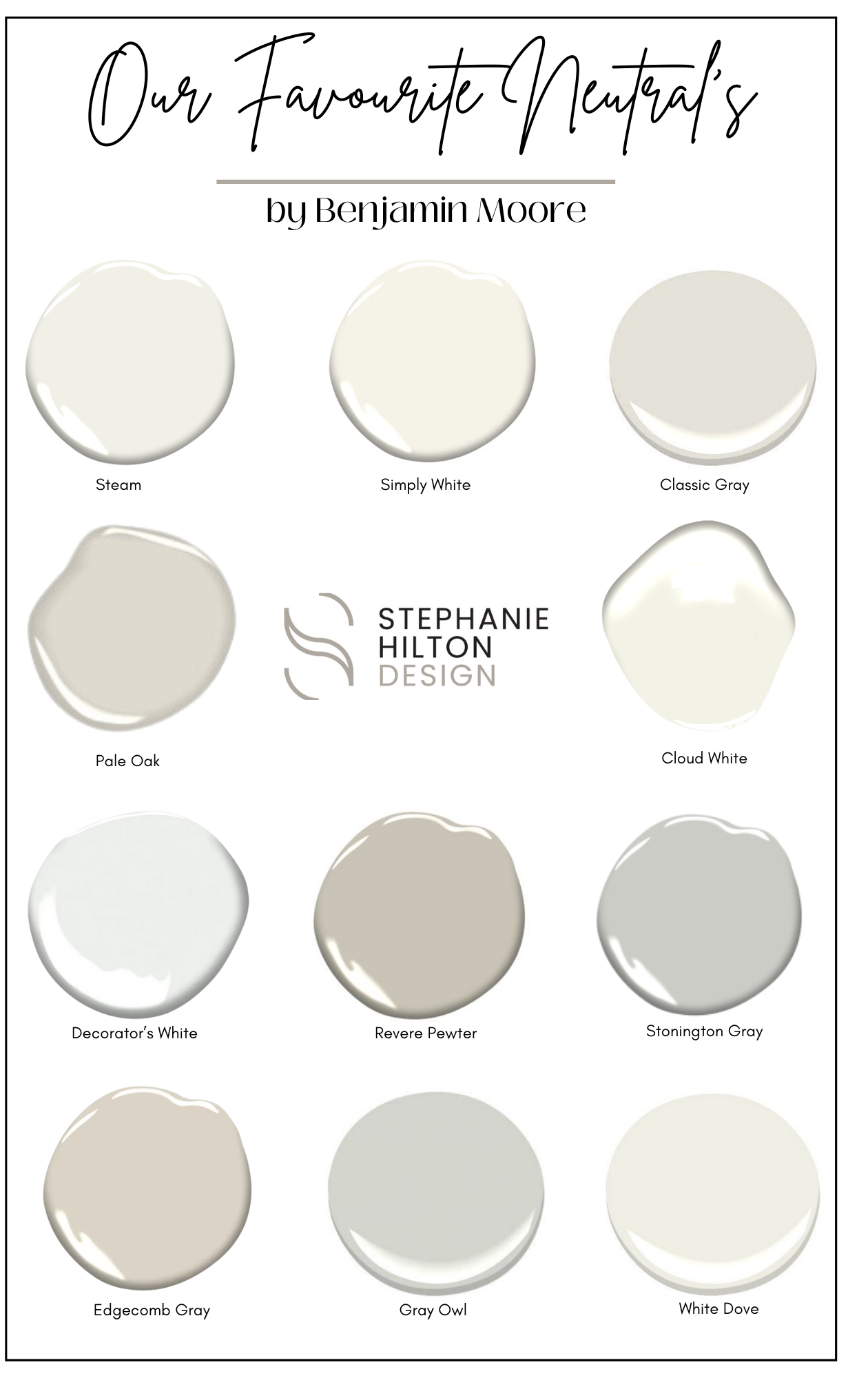
Our favourite neutral paint colours
Choosing neutral paint colors is beneficial because they provide a versatile and timeless foundation for any space. Neutrals create a calming and inviting atmosphere, allowing for greater flexibility in decorating and accessorizing as styles and trends evolve. They also enhance natural light, making rooms feel more open and spacious. Additionally, neutral tones serve as a perfect backdrop for showcasing artwork or bold furnishings, ensuring that your home maintains a cohesive and elegant look while accommodating personal style changes over time.
Neutral paint colors come in a wide range of tones, each offering a unique ambiance to a space. Cool-toned neutrals, like grays and taupes with blue or green undertones, create a calm, modern feel, perfect for minimalist or contemporary designs.
Warm neutrals, such as beige, cream, or greige with hints of yellow or red, bring a cozy and inviting atmosphere to traditional or rustic interiors.
Meanwhile, off-whites and soft, muted shades offer versatility, acting as a subtle backdrop that enhances natural light and complements bold decor elements. Choosing the right neutral depends on the room’s lighting, purpose, and desired mood.
Benjamin Moore is renowned for offering some of the best paint colors due to its extensive and meticulously curated palette, which includes a wide range of shades that cater to various tastes and design styles. Their commitment to quality is evident in the richness and depth of their colors, providing excellent coverage and durability.
If you need helping planning your next design project, please reach out. I’d love to discuss it with you!
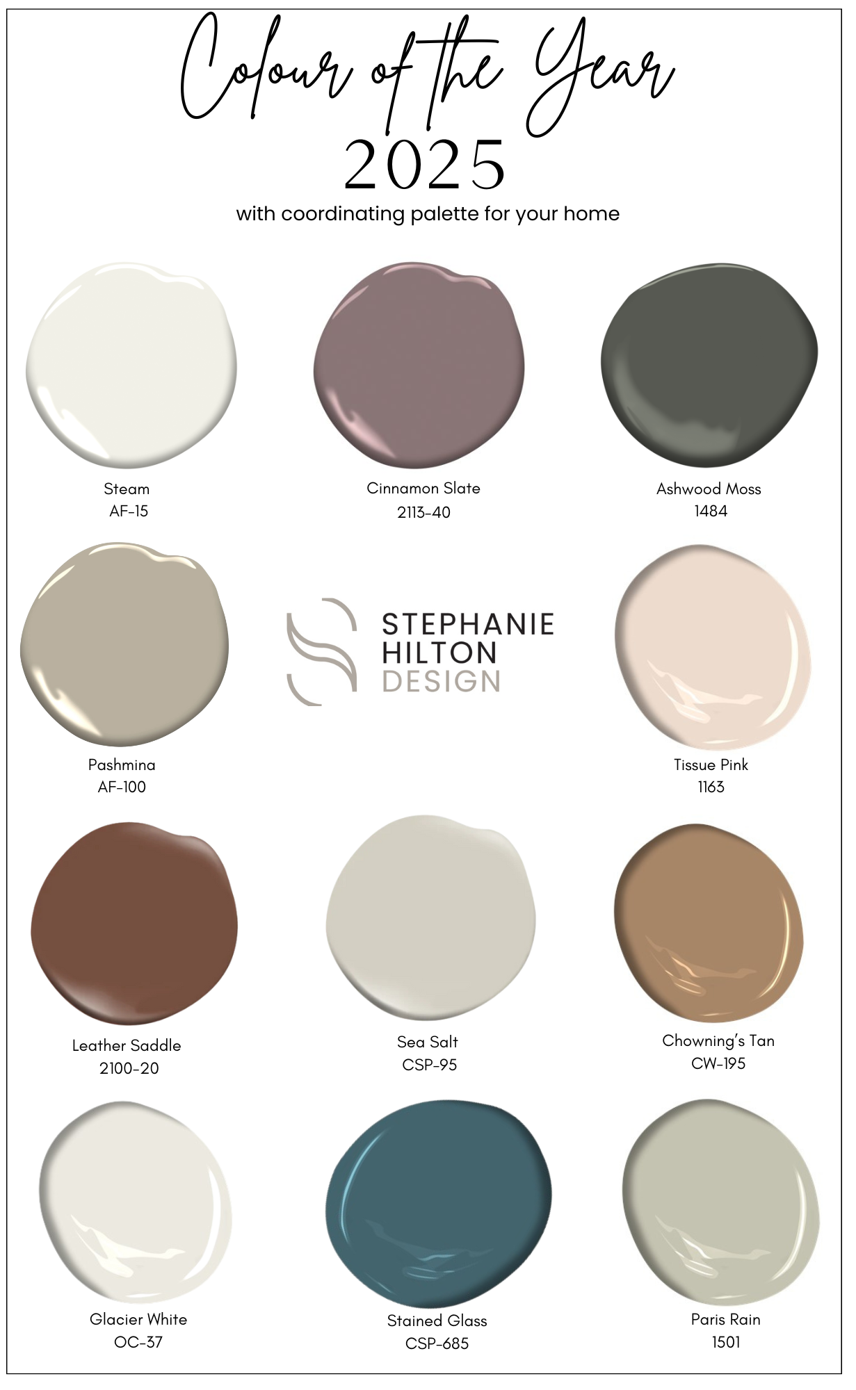
2025 Colour of the year
Benjamin Moore has released their Colour of the Year and Colour Trends for 2025, and we are loving the deep, earthy tones. Cinnamon Slate belongs to the Colour Preview collection. It is warm, rich brown with subtle undertones of red, evoking a cozy and inviting atmosphere that complements both traditional and modern spaces.
TIPS FOR SELECTING THE PERFECT PAINT COLOURS FOR YOUR HOME:
Consider Natural Light: Observe how different colors look in various lighting throughout the day. Natural light can significantly alter a paint's appearance.
Test Samples: Paint small patches on your walls and live with them for a few days to see how the colors change with different times of day and room activities.
Create a Color Palette: Choose a cohesive palette that complements existing furniture, decor, and architectural features to create a harmonious look throughout your home.
Think About Room Function: Consider the mood you want to create; softer colors can promote calmness in bedrooms, while vibrant hues can energize spaces like kitchens or playrooms.
Use the 60-30-10 Rule: This design principle suggests using 60% of a dominant color, 30% of a secondary color, and 10% of an accent color to achieve a balanced and visually appealing space.
Paint plays a crucial role in homes, enhancing aesthetics, protecting surfaces, and influencing the overall mood and ambiance of each space.
If you need helping planning your next design project, please reach out. I’d love to discuss it with you!
Best ceiling fans for every style & budget
Summer is coming and it's getting warmer. Are you prepared to stay cool? We have rounded up our favorite ceiling fans to suit your design style and budget including links to supplier websites for you to shop on-line
Room Size: Measure your room to determine the appropriate fan size. Small rooms (up to 100 sq ft) need fans with a blade span of 29-36 inches, medium rooms (100-300 sq ft) require 42-52 inches, and large rooms (over 300 sq ft) benefit from 52 inches or larger.
Ceiling Height: Ensure the fan is mounted at the right height. For ceilings lower than 8 feet, choose a flush-mount fan. For higher ceilings, consider a downrod to keep the fan at an optimal height of 8-9 feet from the floor.
Blades: Opt for a fan with reversible blades. This feature allows you to change the direction of the blades, providing cool air in the summer and circulating warm air in the winter. Blade Pitch: Look for fans with a blade pitch of 12-15 degrees for optimal airflow. Blades with a higher pitch move more air, making the fan more efficient. Determine how many blades you want, 3 blades lends to a more modern looks whereas 5 blades is more traditional
Lighting: Decide if you need a fan with integrated lighting. Many ceiling fans come with built-in light kits, providing additional illumination in the room.
Control Options: Consider how you want to control the fan. Options include remote controls, wall controls, and smart home integration, allowing for convenient operation.
If you need helping planning your next design project, please reach out. I’d love to discuss it with you!