Branding for Success


Company branding is important because it creates a strong and recognizable identity that sets a business apart from its competitors. A well-defined brand communicates a company’s values, personality, and promise to customers, helping to build trust and loyalty over time. Whether you are an established business, or just starting out, effective branding not only makes a lasting impression but also supports marketing efforts, attracts ideal clients, and can influence how people perceive the quality and credibility of your products or services.
WHAT IS BRANDING?

Branding is the process of creating a distinct identity for a business through elements like its name, logo, colors, messaging, and overall style. It goes beyond just visuals—branding shapes how a company is perceived by its audience and communicates its values, mission, and personality. A strong brand helps customers recognize and remember a business, builds emotional connections, and influences their decision-making. When we think of large corporate companies like Apple, Nike or Google, we don't need words to tell us who they are. They have such a strong brand that just a symbol or colour identifies who they are.

THE IMPORTANCE OF COLOUR IN BRANDING

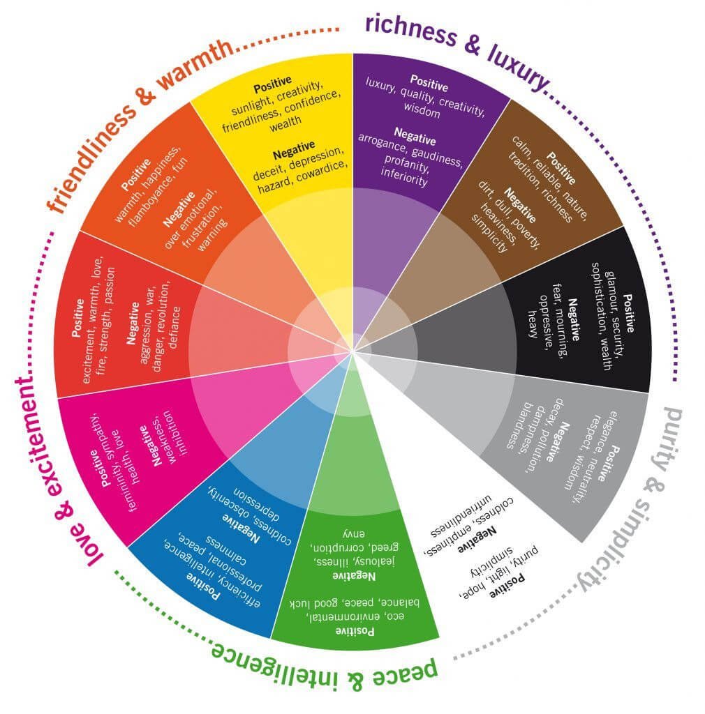
In design school, we studied colour theory and I found (and sill find) it fascinating how colour affects us in every day life - from the clothes we wear, the colour of interiors & company branding. Colour plays such a huge role in how we feel and how we are marketed. Have you ever noticed that many fast food restaurants are yellow and red? Think of McDonalds, Subways, Wendy's, Fatburger & Burger King. Red not only symbolizes love, passion and anger, it also makes us feel hungry. Yellow triggers a feeling of a hazard and makes us want to leave that environment. FAST food is just that, they want customers in and out for the next customer.

Johann Wolfgang von Goethe is a notable figure in colour theory. Goethe was born in Frankfurt, Germany in 1749. He was a poet, playwright, novelist, scientist, statesman, theatre director, artist, and critic. Goethe studied law but found his true passion in drawing and writing. Throughout his life, he wrote across various genres, including poetry, drama, novels, and scientific papers. He is considered to be the most influential German writer. Goethe approached color from a holistic and subjective perspective, focusing on its psychological and philosophical properties.
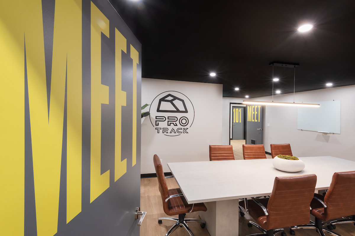
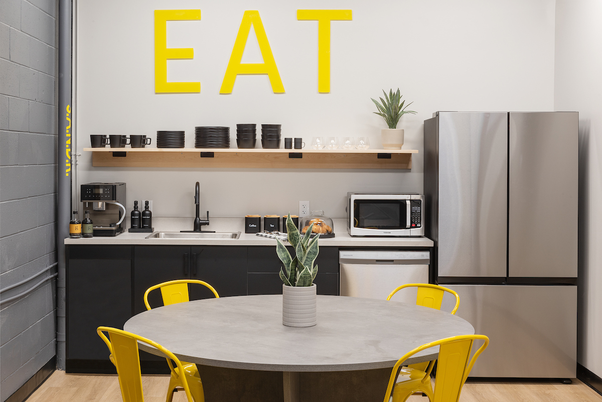
We recently completed a commercial office space for a client whose brand colours are charcoal grey and bright yellow. We incorporated these colours throughout their space through paint, signage and accessories. In their lunchroom, yellow is not meant to infer any negative emotions, but instead evoke friendliness, & creativity.

CONSISTENCY IS KEY

Consistency in branding is important because it helps build trust, recognition, and loyalty with your audience. When your brand presents a unified look, tone, and message across all platforms—whether it's your logo, website, social media, or packaging—it creates a strong and memorable identity. This consistency reinforces who you are as a company and makes it easier for customers to connect with and remember your brand.
When I rebranded my company a few years back, I worked with a local graphic and web design firm, Soap Box Studios to redesign my logo, rebrand and create a new website for me. Like the Interior Design process, they had their own process to capture what I was looking for. I wasn't entirely sure, but through a series of questions about what image I wanted to convey to potential clients, what colors I liked (and disliked) and my target audience, they nailed it. I prefer simple clean lines, earth tones and easy to read fonts. I wanted a brand that stood out, without being too bold, and I wanted it to be recognizable, but soft and warm.

I use my brand consistently in my business documents, client presentations, marketing, social media posts and website. This communicates professionalism and reliability, which are essential for standing out in a competitive market and fostering long-term customer relationships. It also shows that I am organized and have a well thought out business, which translates into how I work as a designer.
In conclusion, strong company branding is more than just a logo or a color palette—it’s the foundation of how a business communicates its values, personality, and purpose. Effective branding creates a lasting impression, builds credibility, and helps set a company apart in a crowded marketplace. By investing in a clear and consistent brand identity, businesses can foster deeper connections with their audience and drive long-term success.

An interior designer can help build brand identity for a business by creating a physical space that reflects the company's values, style, and personality, leaving a lasting impression on clients and customers. If you need helping planning your new commercial project, please reach out. I’d love to discuss it with you!

Designing with black


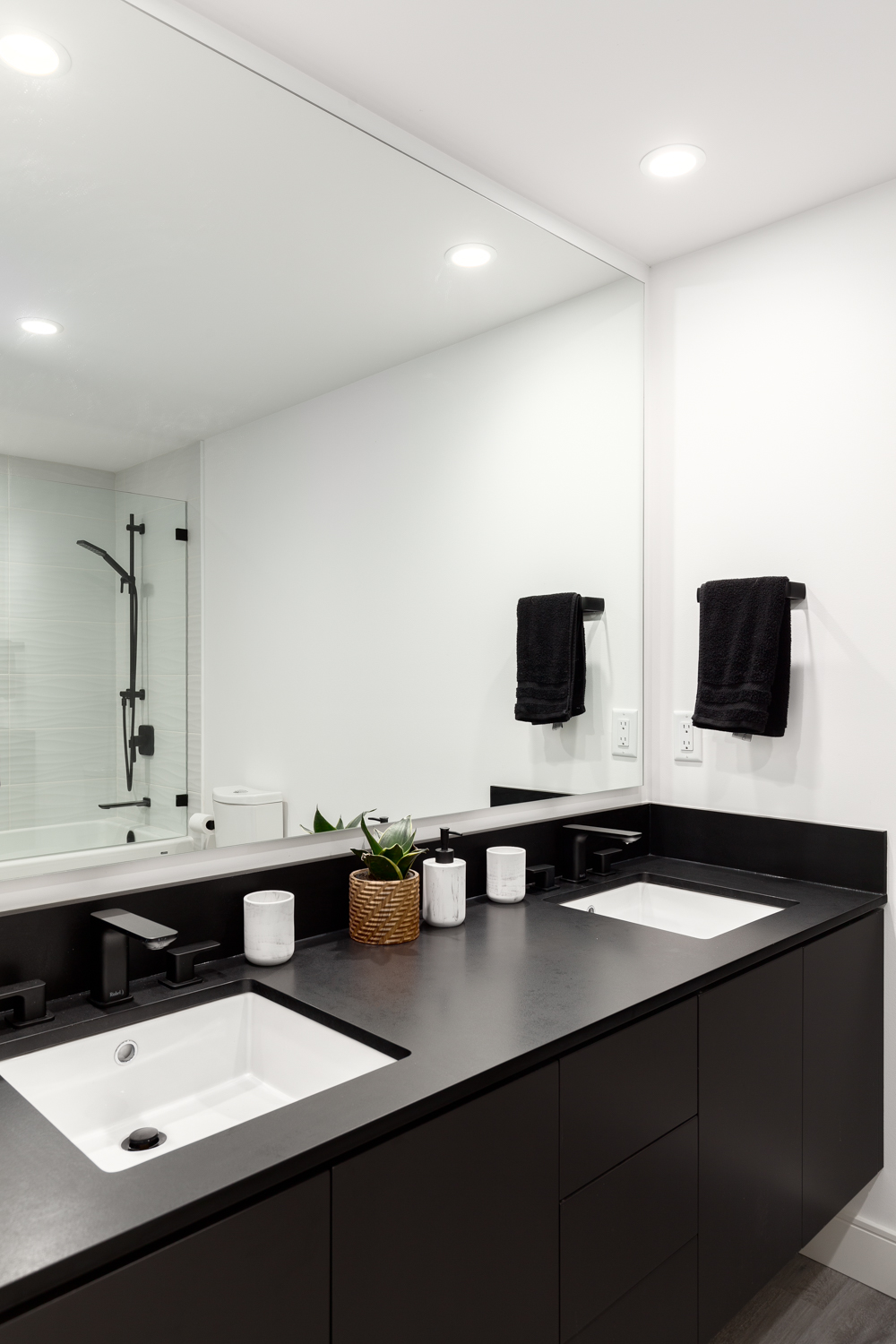
Black is a great color choice for interiors because it adds contrast, and depth to a space. It exudes luxury and sophistication, making any room feel more refined. Black is considered a neutral color in design because it pairs well with virtually any other color and serves as a versatile foundation for various aesthetics. It pairs well with almost any color, allowing for classic or modern aesthetics and can be used in accents such as furniture, lighting or hardware or as a bold statement such as black walls or ceilings.

BLACK MILLWORK & MONOCHROMATIC DESIGN

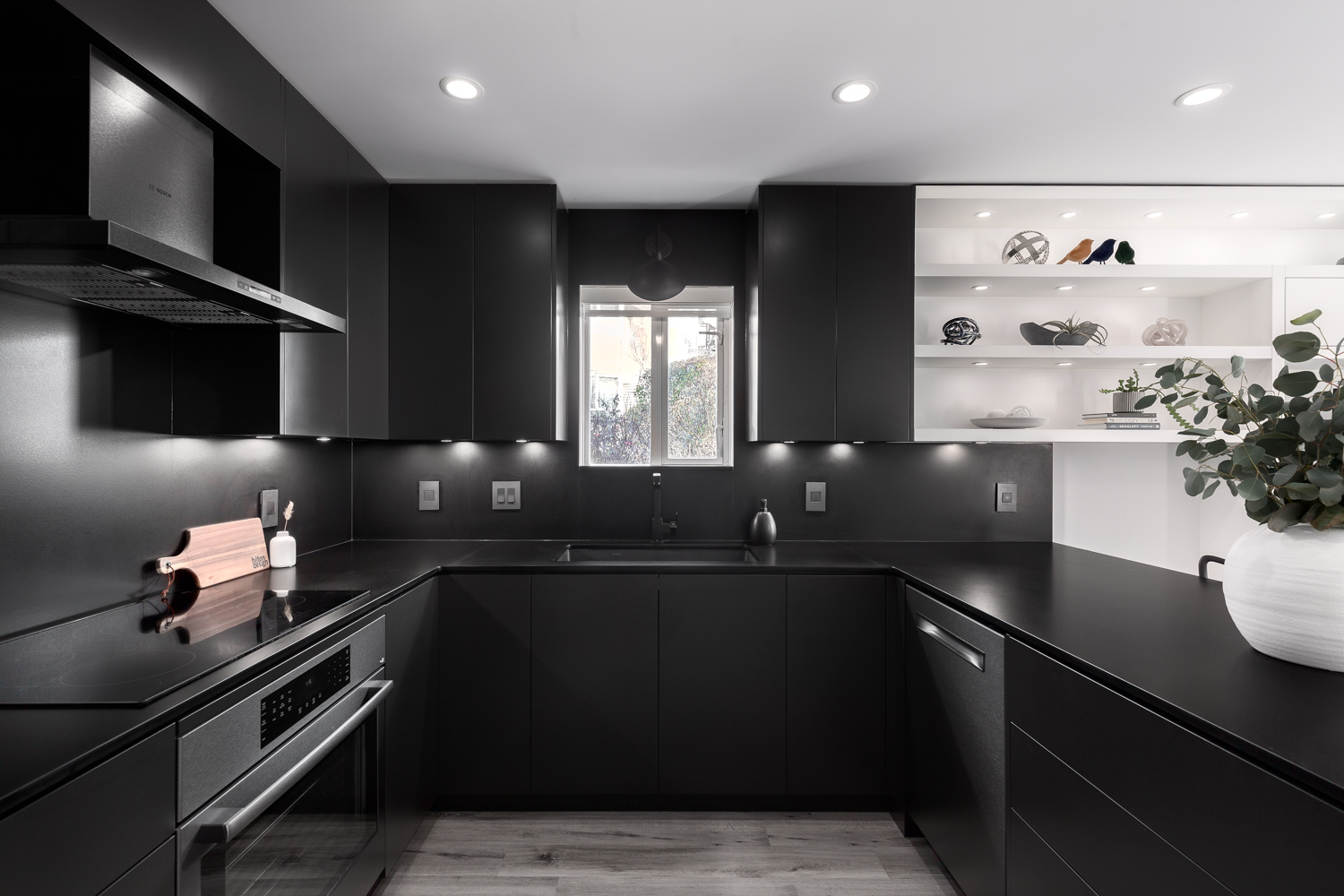
Dark cabinetry creates a bold statement against lighter neutrals, and creates a moody, monochromatic look as shown in this renovation. In monochromatic design, black often serves as the dominant color in a monochromatic space, creating a bold and dramatic effect. A monochromatic color scheme relies on variations of a single color, typically using different shades, tints, and tones to add dimension. In a grayscale monochromatic scheme, black is often used to anchor the design, balancing out lighter shades of gray and white.

FEATURE WALLS & CEILINGS

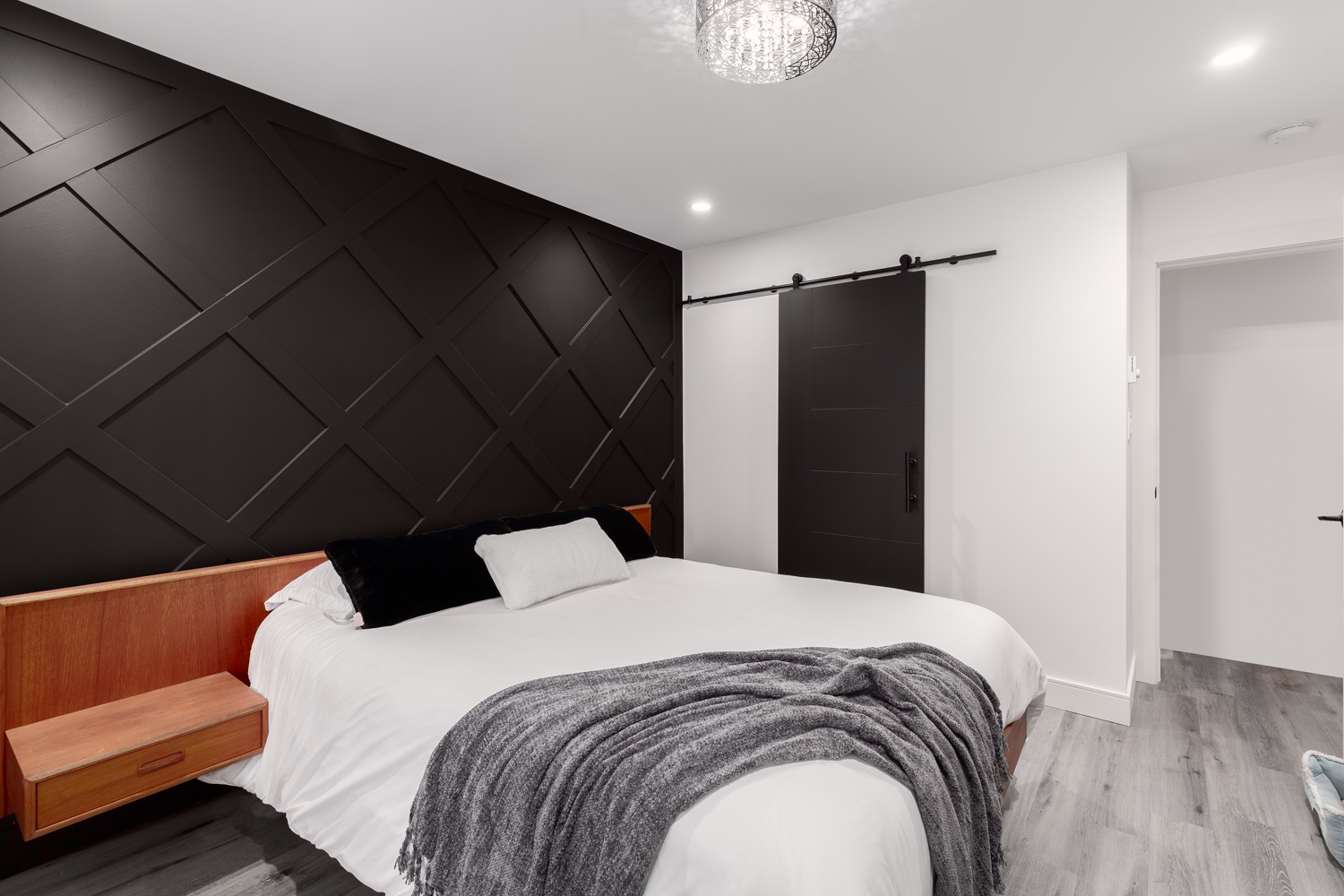
Whether in a living room, bedroom, or office, a black accent wall creates a striking focal point that enhances the surrounding decor. When balanced with proper lighting and complementary colors, a black feature wall becomes a timeless statement piece that elevates the entire room.

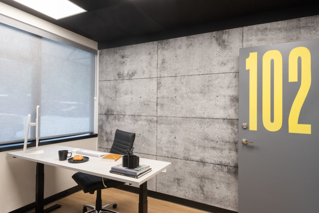
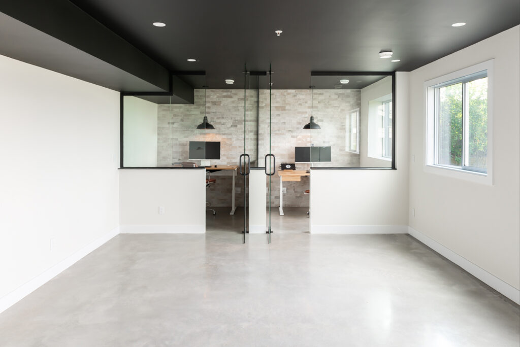
Black ceilings create a cozy, intimate atmosphere, perfect for powder rooms, home theaters, or bedrooms. They work well in industrial, modern, and moody aesthetic designs. To avoid making the space feel too small, pair black ceilings with white or light-colored walls. We used "Black Magic" by Dulux on the ceilings, and "Steam" by Benjamin Moore on the walls of this home office space

The key is to using black furniture and accessories is to balance black with other elements to avoid an overly heavy or dark Pair black furniture & accessories with natural materials like wood, linen, or marble to soften the look. Introduce bold color in decor to prevent the space from feeling too monochromatic, unless of course that is the look you are going for.

Use black mirrors or artwork frames to tie elements together. Black rugs or throw blankets create coziness without overwhelming the space. Matte black gives a soft, modern, and moody feel, while glossy black adds a sleek and contemporary touch.

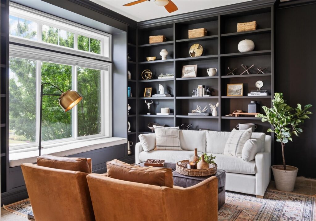
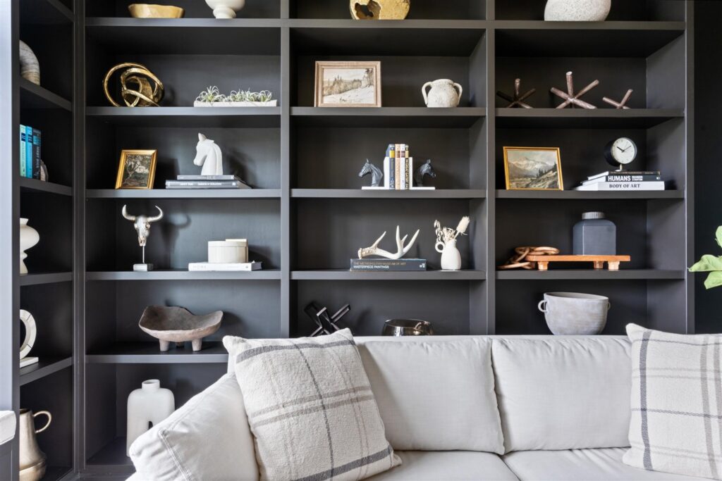
Black is a fantastic backdrop for display shelving because it allows other design elements to stand out. Unlike bright colors, black recedes into the background, making a space feel more expansive. Black absorbs light, making it perfect for moody, intimate spaces like bedrooms or this reading lounge we designed for our client.

MIXING METALS

Mixing black with metallic finishes in interiors creates a and visually dynamic space. The key is to blend the right metal tones with black to achieve harmony and contrast. Combining black with gold or brass adds warmth and luxury to space. You can achieve this look by incorporating mixed metal hardware, accessories, lighting and mirrors.

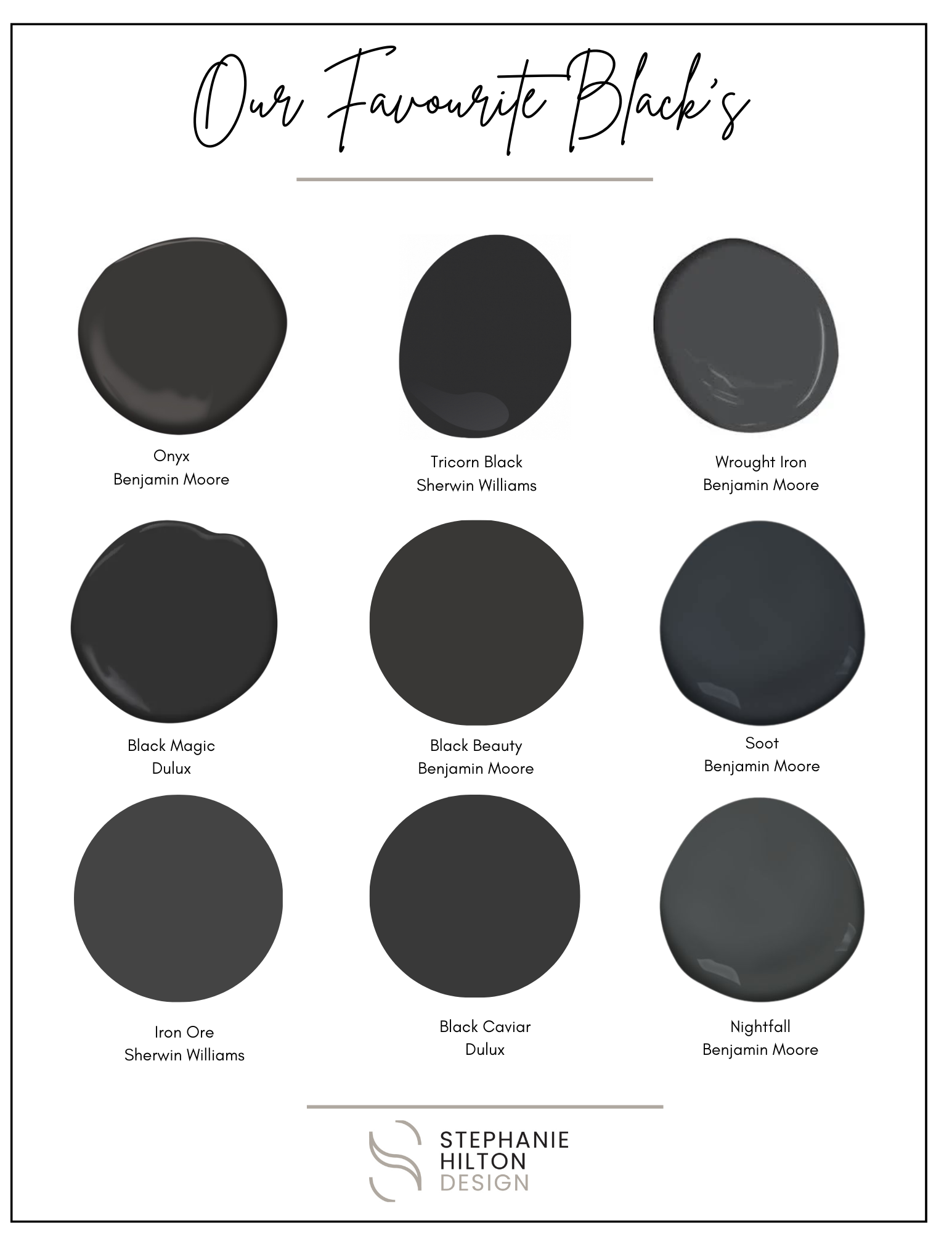
We have curated a list of our favorite black paint colors. And of these colors can be used for cabinetry, walls, ceilings and accents. Pair these with another neutral for a cohesive and inviting home, or add in a warm trendy colour for a current & modern space. Check out our other blogs for design & decorating tips for your home.

If you need helping planning your next design project, please reach out. I’d love to discuss it with you!
How to create a timeless kitchen


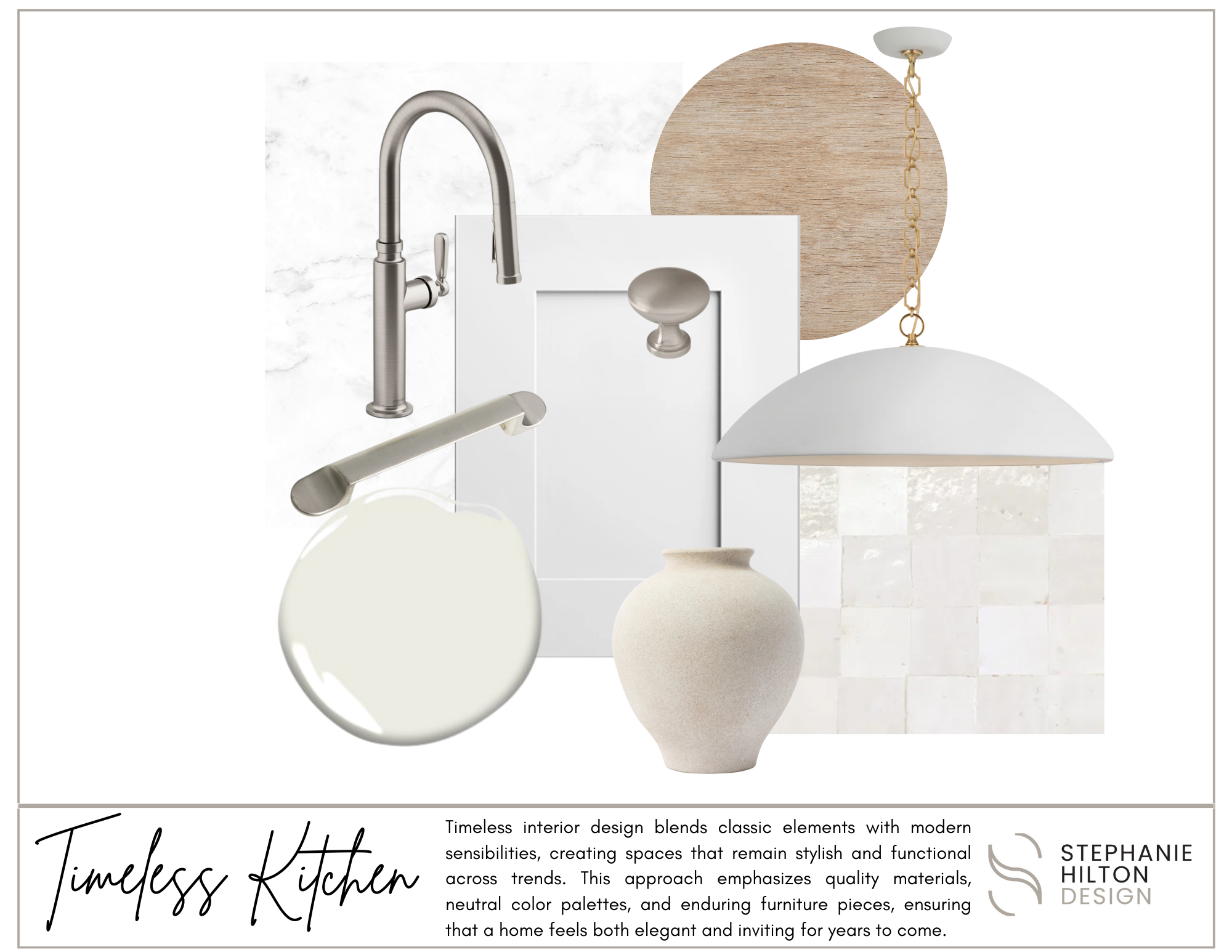
Creating a timeless kitchen involves a blend of classic design elements and functional practicality. Start by choosing a neutral color palette for walls and cabinetry, which provides a versatile backdrop for various styles. Incorporate high-quality materials like marble countertops, hardwood floors, and durable fixtures that stand the test of time. Opt for traditional cabinetry styles, such as Shaker or beadboard, which offer both charm and functionality. Layer in lighting with a mix of ambient, task, and accent options to enhance the space’s warmth and usability. Finally, keep decor simple and understated, allowing for easy updates ensuring your kitchen remains stylish and inviting for years to come.

5 MATERIALS TO USE IN A TIMELESS KITCHEN:

  1. Marble: This luxurious stone adds elegance and sophistication, making it ideal for countertops and backsplashes.
  2. Hardwood: Rich, warm hardwood floors bring warmth and character, while also offering durability and easy maintenance.
  3. Stainless Steel: Durable and sleek, stainless steel appliances and fixtures provide a modern touch without compromising a classic aesthetic.
  4. Shaker-Style Cabinets: Simple and functional, Shaker cabinets in painted or natural wood finishes offer a timeless look that pairs well with various styles.
  5. Subway Tile: Classic white or colored subway tiles are versatile for backsplashes, providing a clean, understated look that complements any design scheme.

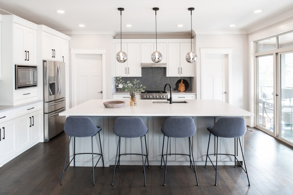
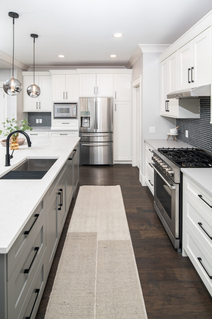
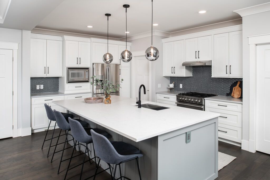
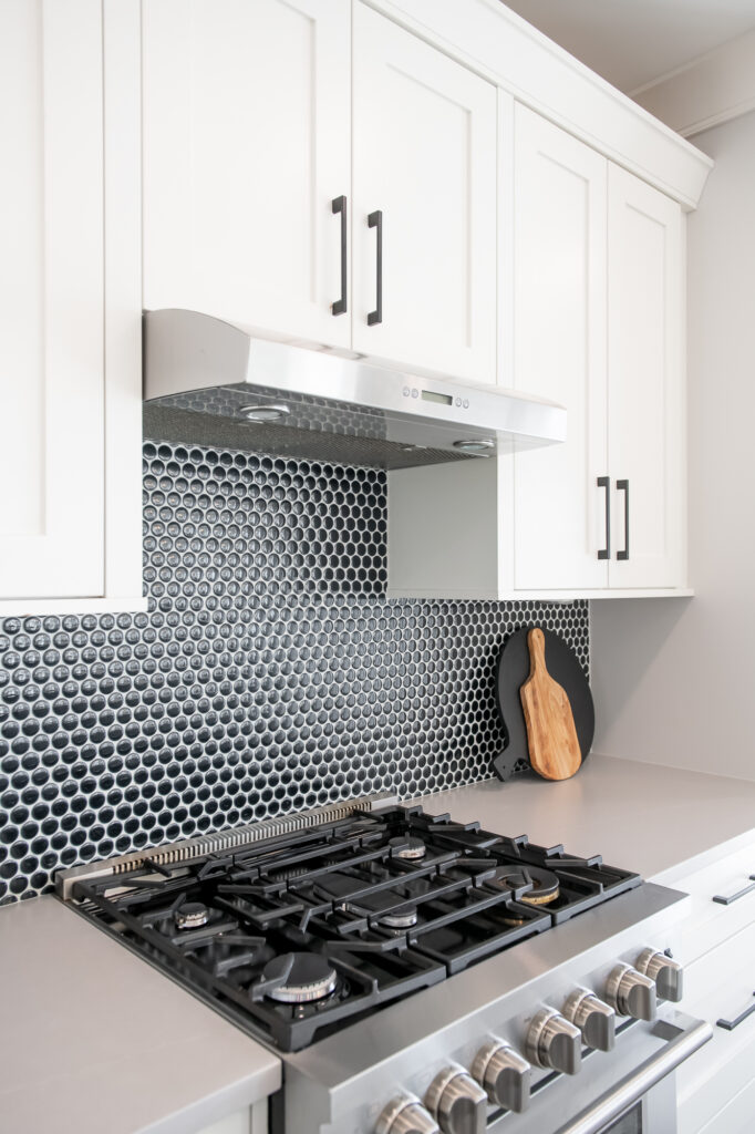
This kitchen we designed reflects timelesss design with added bold accents such as black fixtures & hardware, and classic penny tile backsplash to add colour to the otherwise neutral shaker kitchen.

Neutral paint colors are ideal for a timeless kitchen because they create a versatile backdrop that enhances the room's overall design without overwhelming it. These hues, such as whites, grays, and beiges, promote a sense of calm and spaciousness, making it easier to incorporate various styles and decor elements over time. Additionally, neutral colors allow for easy updates through accessories and accents, ensuring the kitchen remains stylish and relevant as trends change. This enduring palette also highlights architectural features and high-quality materials, reinforcing a classic, sophisticated aesthetic.

If you need helping planning your next design project, please reach out. I’d love to discuss it with you!
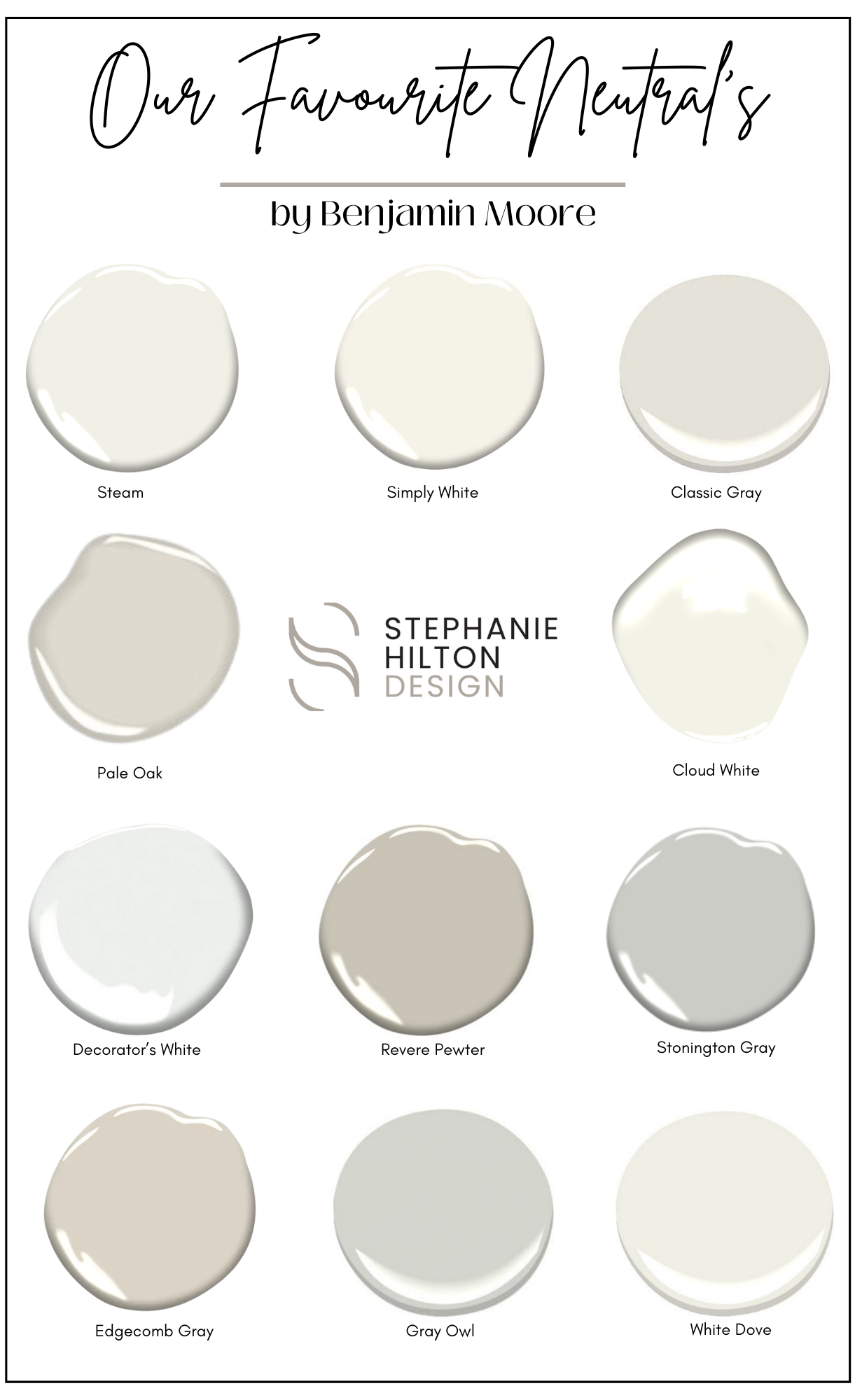
Our favourite neutral paint colours


Choosing neutral paint colors is beneficial because they provide a versatile and timeless foundation for any space. Neutrals create a calming and inviting atmosphere, allowing for greater flexibility in decorating and accessorizing as styles and trends evolve. They also enhance natural light, making rooms feel more open and spacious. Additionally, neutral tones serve as a perfect backdrop for showcasing artwork or bold furnishings, ensuring that your home maintains a cohesive and elegant look while accommodating personal style changes over time.

Neutral paint colors come in a wide range of tones, each offering a unique ambiance to a space. Cool-toned neutrals, like grays and taupes with blue or green undertones, create a calm, modern feel, perfect for minimalist or contemporary designs.

Warm neutrals, such as beige, cream, or greige with hints of yellow or red, bring a cozy and inviting atmosphere to traditional or rustic interiors.

Meanwhile, off-whites and soft, muted shades offer versatility, acting as a subtle backdrop that enhances natural light and complements bold decor elements. Choosing the right neutral depends on the room’s lighting, purpose, and desired mood.

Benjamin Moore is renowned for offering some of the best paint colors due to its extensive and meticulously curated palette, which includes a wide range of shades that cater to various tastes and design styles. Their commitment to quality is evident in the richness and depth of their colors, providing excellent coverage and durability.

If you need helping planning your next design project, please reach out. I’d love to discuss it with you!
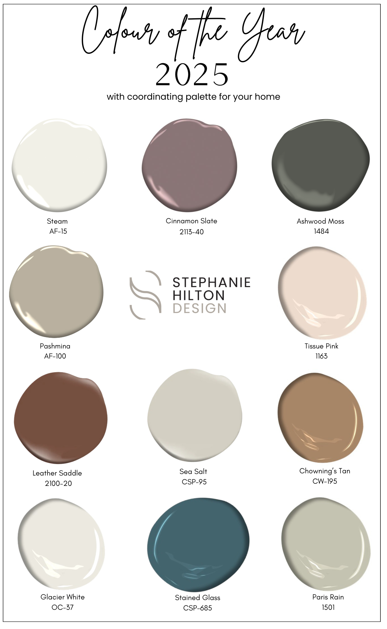
2025 Colour of the year


Benjamin Moore has released their Colour of the Year and Colour Trends for 2025, and we are loving the deep, earthy tones. Cinnamon Slate belongs to the Colour Preview collection. It is warm, rich brown with subtle undertones of red, evoking a cozy and inviting atmosphere that complements both traditional and modern spaces.

TIPS FOR SELECTING THE PERFECT PAINT COLOURS FOR YOUR HOME:

Paint plays a crucial role in homes, enhancing aesthetics, protecting surfaces, and influencing the overall mood and ambiance of each space.

If you need helping planning your next design project, please reach out. I’d love to discuss it with you!
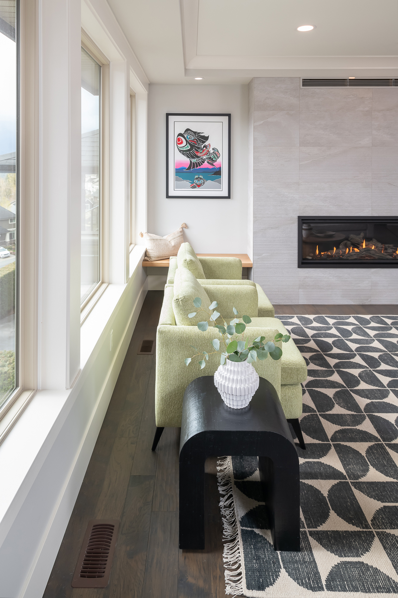
Modern vs Contemporary Design Style

While modern and contemporary are two styles of interior design with similarities, they have significant variations. Having this distinction, it is possible to better navigate the process of choosing what exactly to do in home decoration.

Defining Modern Design

It has existed since the early to mid-20th century when the world tended to depart from Victorian decorative styles. The hallmarks of modern style are sleek, plain, subdued, practical, and generally low on adornment.

Some essential qualities of modern design include:

Defining Contemporary Design

Modern style Desingn

Contemporary styles emerged alongside modern designs but with more emphasis on eclectic styles. Like the modern style of architecture, contemporary is characterized by clean, minimalist aesthetics, primary importance on neutral colors, and a focus on function – but deviates significantly from modernism in the way it treats form, shape, and uniqueness.

Critical qualities of contemporary design:

The Similarities of Both Styles

Modern and contemporary share an emphasis on:

Minimalism

Both styles include using vast public area, oversized windows, lack of decoration and graphic simplicity. Plain and bare is what the aesthetic of your home should be and they don’t possess anything that is not significant and practical.

Neutral Schemes

It looks best for those who prefer bright accessories as whites, grays and black are versatile in any of the presented styles. They arrange beautiful, quiet spaces.

Furniture Functionality

Essential features of both styles are that they are practical and mobile furniture for flexible use. Disc converts over time as do sectional sofas, ottomans and other convertible pieces.

Contrasting Characteristics Inherent between both Styles

While modern and contemporary share some significant picture values, divergences emerge in: 

Openness to Color

Modern percusses colors, contemporary embraces vivid and bright notes even if everything is monochromic.

The modern favors rectilinear, -box like shapes; the contemporary has the geometrical lines with irregular shapes, angles.

Individualistic Expression

Modern style therefore desires generic, open, and accessible objects; while contemporaries enjoy singular, individually produced objects with personality.

Interior Design

Interiors combine these styles depending on owner’s preferences, specific spaces and vision of designers in practice. An example of an integrated design concept based on the current principles might include using some pieces of modern-style furniture or paintings.

Applying the Modern or Contemporary Style

Modern Materials

Some essential materials that align with modern and contemporary aesthetics include:

Contemporary Textures

Mixing sleek and soft textures creates depth in contemporary interiors through:

- Shearling throws

- Velvet pillows

- Natural fiber rugs

- Brushed metals

Modern Color Choices

Color schemes adhere to a simplified, neutral modern palette:

- Black

- White 

- Gray

- Tan

- Off-white

Contemporary design

Contemporary design welcomes vibrant accent colors like:

- Chartreuse

- Sapphire blue

- Emerald green

- Crimson red

No matter the style, well-designed spaces share common principles:

- Consistent color flows

- Cohesive material mixes

- Repeated design motifs

- Combined sizes of furnishings proportional to the sizes of the rooms they furnish.

These design and create comprehensive element, integration, and cohesiveness, which are home-like and adaptable to a homeowner’s daily schedule.