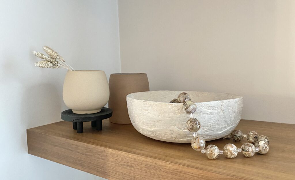
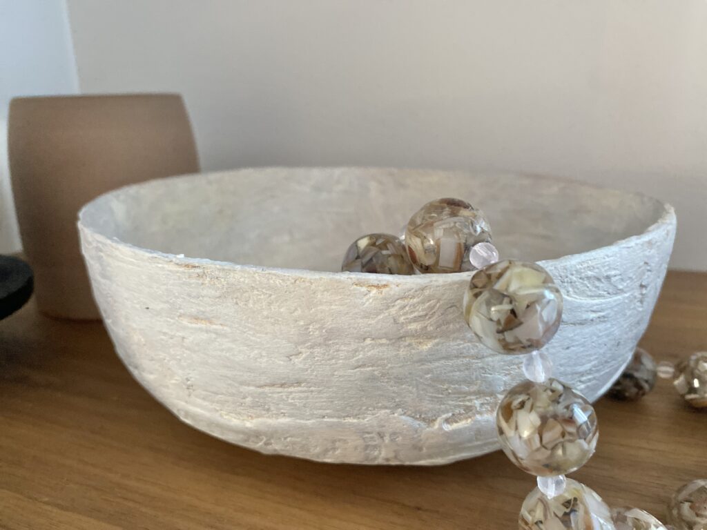
Branding for Success


Company branding is important because it creates a strong and recognizable identity that sets a business apart from its competitors. A well-defined brand communicates a company’s values, personality, and promise to customers, helping to build trust and loyalty over time. Whether you are an established business, or just starting out, effective branding not only makes a lasting impression but also supports marketing efforts, attracts ideal clients, and can influence how people perceive the quality and credibility of your products or services.

WHAT IS BRANDING?

Branding is the process of creating a distinct identity for a business through elements like its name, logo, colors, messaging, and overall style. It goes beyond just visuals—branding shapes how a company is perceived by its audience and communicates its values, mission, and personality. A strong brand helps customers recognize and remember a business, builds emotional connections, and influences their decision-making. When we think of large corporate companies like Apple, Nike or Google, we don't need words to tell us who they are. They have such a strong brand that just a symbol or colour identifies who they are.

THE IMPORTANCE OF COLOUR IN BRANDING

In design school, we studied colour theory and I found (and sill find) it fascinating how colour affects us in every day life - from the clothes we wear, the colour of interiors & company branding. Colour plays such a huge role in how we feel and how we are marketed. Have you ever noticed that many fast food restaurants are yellow and red? Think of McDonalds, Subways, Wendy's, Fatburger & Burger King. Red not only symbolizes love, passion and anger, it also makes us feel hungry. Yellow triggers a feeling of a hazard and makes us want to leave that environment. FAST food is just that, they want customers in and out for the next customer.

Johann Wolfgang von Goethe is a notable figure in colour theory. Goethe was born in Frankfurt, Germany in 1749. He was a poet, playwright, novelist, scientist, statesman, theatre director, artist, and critic. Goethe studied law but found his true passion in drawing and writing. Throughout his life, he wrote across various genres, including poetry, drama, novels, and scientific papers. He is considered to be the most influential German writer. Goethe approached color from a holistic and subjective perspective, focusing on its psychological and philosophical properties.

We recently completed a commercial office space for a client whose brand colours are charcoal grey and bright yellow. We incorporated these colours throughout their space through paint, signage and accessories. In their lunchroom, yellow is not meant to infer any negative emotions, but instead evoke friendliness, & creativity.

CONSISTENCY IS KEY

Consistency in branding is important because it helps build trust, recognition, and loyalty with your audience. When your brand presents a unified look, tone, and message across all platforms—whether it's your logo, website, social media, or packaging—it creates a strong and memorable identity. This consistency reinforces who you are as a company and makes it easier for customers to connect with and remember your brand.

When I rebranded my company a few years back, I worked with a local graphic and web design firm, Soap Box Studios to redesign my logo, rebrand and create a new website for me. Like the Interior Design process, they had their own process to capture what I was looking for. I wasn't entirely sure, but through a series of questions about what image I wanted to convey to potential clients, what colors I liked (and disliked) and my target audience, they nailed it. I prefer simple clean lines, earth tones and easy to read fonts. I wanted a brand that stood out, without being too bold, and I wanted it to be recognizable, but soft and warm.

I use my brand consistently in my business documents, client presentations, marketing, social media posts and website. This communicates professionalism and reliability, which are essential for standing out in a competitive market and fostering long-term customer relationships. It also shows that I am organized and have a well thought out business, which translates into how I work as a designer.

In conclusion, strong company branding is more than just a logo or a color palette—it’s the foundation of how a business communicates its values, personality, and purpose. Effective branding creates a lasting impression, builds credibility, and helps set a company apart in a crowded marketplace. By investing in a clear and consistent brand identity, businesses can foster deeper connections with their audience and drive long-term success.

An interior designer can help build brand identity for a business by creating a physical space that reflects the company's values, style, and personality, leaving a lasting impression on clients and customers. If you need helping planning your new commercial project, please reach out. I’d love to discuss it with you!

Designing with black


Black is a great color choice for interiors because it adds contrast, and depth to a space. It exudes luxury and sophistication, making any room feel more refined. Black is considered a neutral color in design because it pairs well with virtually any other color and serves as a versatile foundation for various aesthetics. It pairs well with almost any color, allowing for classic or modern aesthetics and can be used in accents such as furniture, lighting or hardware or as a bold statement such as black walls or ceilings.

BLACK MILLWORK & MONOCHROMATIC DESIGN

Dark cabinetry creates a bold statement against lighter neutrals, and creates a moody, monochromatic look as shown in this renovation. In monochromatic design, black often serves as the dominant color in a monochromatic space, creating a bold and dramatic effect. A monochromatic color scheme relies on variations of a single color, typically using different shades, tints, and tones to add dimension. In a grayscale monochromatic scheme, black is often used to anchor the design, balancing out lighter shades of gray and white.

FEATURE WALLS & CEILINGS

Whether in a living room, bedroom, or office, a black accent wall creates a striking focal point that enhances the surrounding decor. When balanced with proper lighting and complementary colors, a black feature wall becomes a timeless statement piece that elevates the entire room.

Black ceilings create a cozy, intimate atmosphere, perfect for powder rooms, home theaters, or bedrooms. They work well in industrial, modern, and moody aesthetic designs. To avoid making the space feel too small, pair black ceilings with white or light-colored walls. We used "Black Magic" by Dulux on the ceilings, and "Steam" by Benjamin Moore on the walls of this home office space

The key is to using black furniture and accessories is to balance black with other elements to avoid an overly heavy or dark Pair black furniture & accessories with natural materials like wood, linen, or marble to soften the look. Introduce bold color in decor to prevent the space from feeling too monochromatic, unless of course that is the look you are going for.

Use black mirrors or artwork frames to tie elements together. Black rugs or throw blankets create coziness without overwhelming the space. Matte black gives a soft, modern, and moody feel, while glossy black adds a sleek and contemporary touch.

Black is a fantastic backdrop for display shelving because it allows other design elements to stand out. Unlike bright colors, black recedes into the background, making a space feel more expansive. Black absorbs light, making it perfect for moody, intimate spaces like bedrooms or this reading lounge we designed for our client.

MIXING METALS

Mixing black with metallic finishes in interiors creates a and visually dynamic space. The key is to blend the right metal tones with black to achieve harmony and contrast. Combining black with gold or brass adds warmth and luxury to space. You can achieve this look by incorporating mixed metal hardware, accessories, lighting and mirrors.

We have curated a list of our favorite black paint colors. And of these colors can be used for cabinetry, walls, ceilings and accents. Pair these with another neutral for a cohesive and inviting home, or add in a warm trendy colour for a current & modern space. Check out our other blogs for design & decorating tips for your home.

If you need helping planning your next design project, please reach out. I’d love to discuss it with you!

DIY bunk bed for under $200

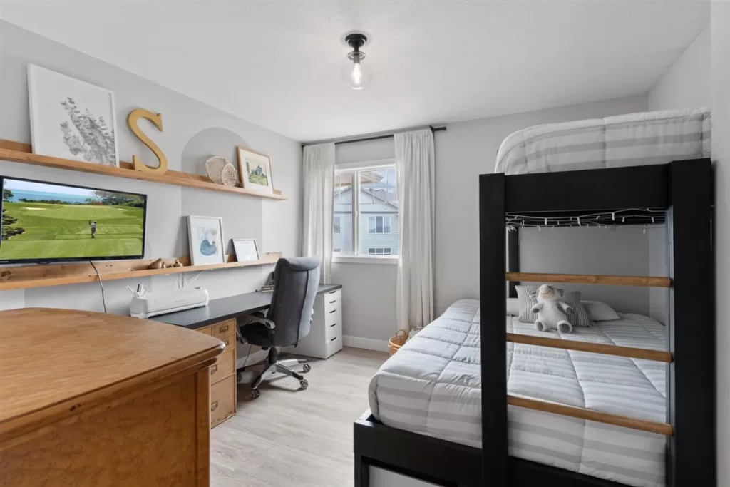
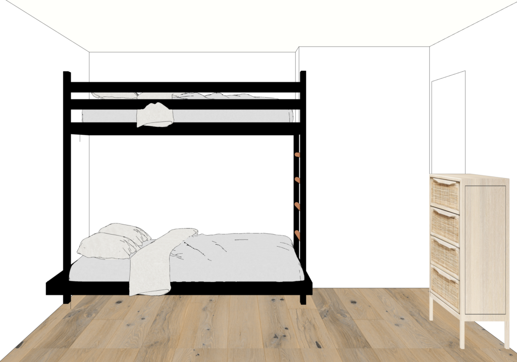
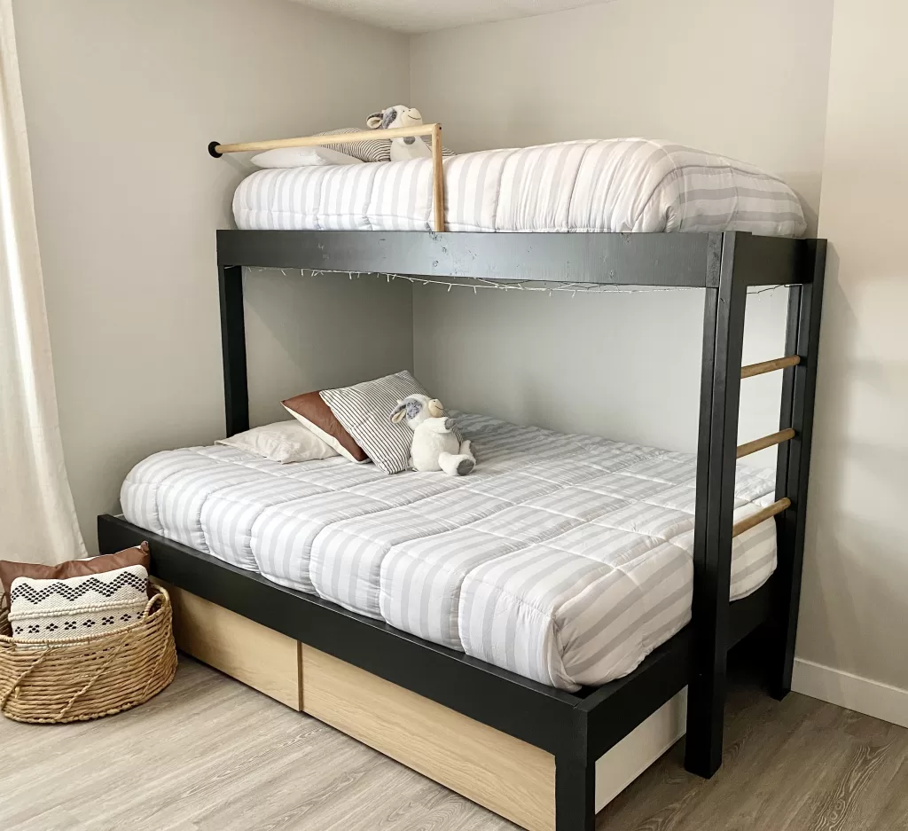
We desperately needed to add some extra space for guests and kids sleepovers, as this room also doubles as my home office. None of the store bought bunks beds were really our taste, and were super expensive for what you got. It is also hard to find bunks that have a queen bed on the bottom and a single on top, so we decided to build our own DIY bunkbed that would fit our space perfectly. This blog will give you step-by-step instructions, photos, and a material list so you can build your own DIY bunkbed for a fraction of the cost of store bought bunks.

MATERIALS LIST:

TOOLS REQUIRED:

THE DESIGN:

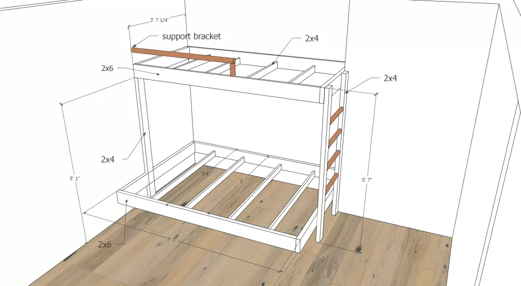
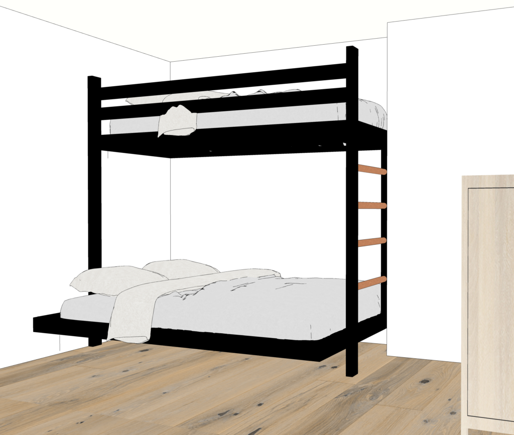
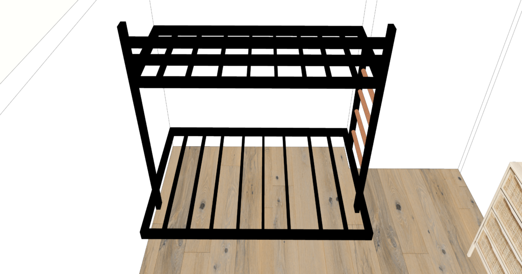
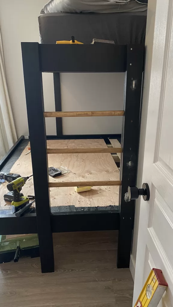
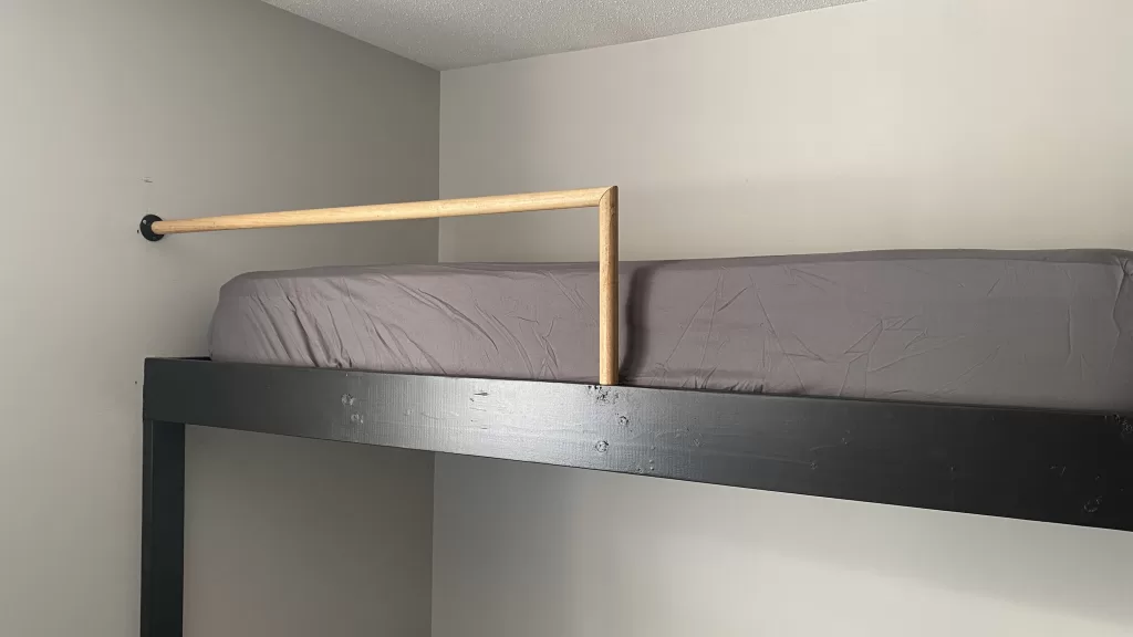
My design of our DIY bunkbed changed a a bit throughout the construction of the bunks, and we made some modifications on the fly to add additional support. I originally had 2x4's as the safety rail, then changed that to round dowel to complement the ladder, didn't need as many cross supports as I had originally thought, and changed the construction of the ladder.

STEP 1: PREPAINT YOUR LUMBER

You will thank me later. Paint all lumber and plywood before starting your cuts. You can easily touch up after and not have to worry about getting paint all over your walls.

STEP 2: MEASURE YOUR SIDE & TOP RAILS & CUT

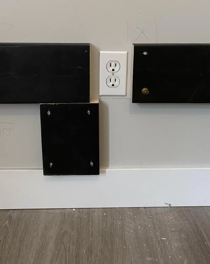
We had a nook in our guest bedroom so we decided to cut our boards to fit this nook to give us as much floor space as possible, and having walls on 3 sides would allow extra support. Remember, queen size mattresses are 60" x 80", and single mattresses are 38" x 75" so the top bunk will have a little extra room at the foot of the bed, or get a twin XL mattress which is 38" x 80". Attach the boards onto the wall directly into studs using the GRK Fasteners. We wanted 12" under the bed for storage bins, so we had electrical outlets to work around, we figured this out as we went along.

STEP 3: INSTALL OUTER SIDE RAILS & CROSS SUPPORTS

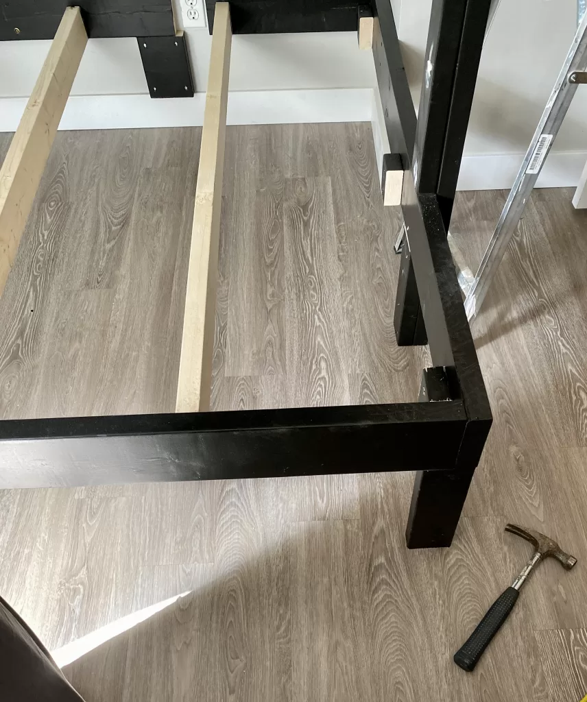
Attach the outer side rails by butting inside the top and foot rails and screwing in place. Use a temporary support in the corners if needed until you are ready to install the ladder.

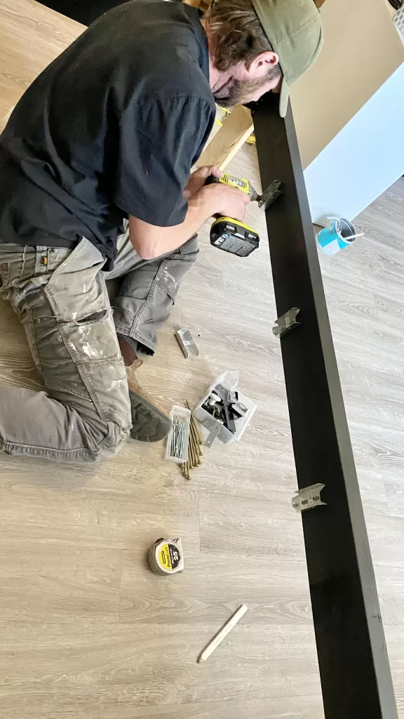
Install the joist hangers spaced equally.

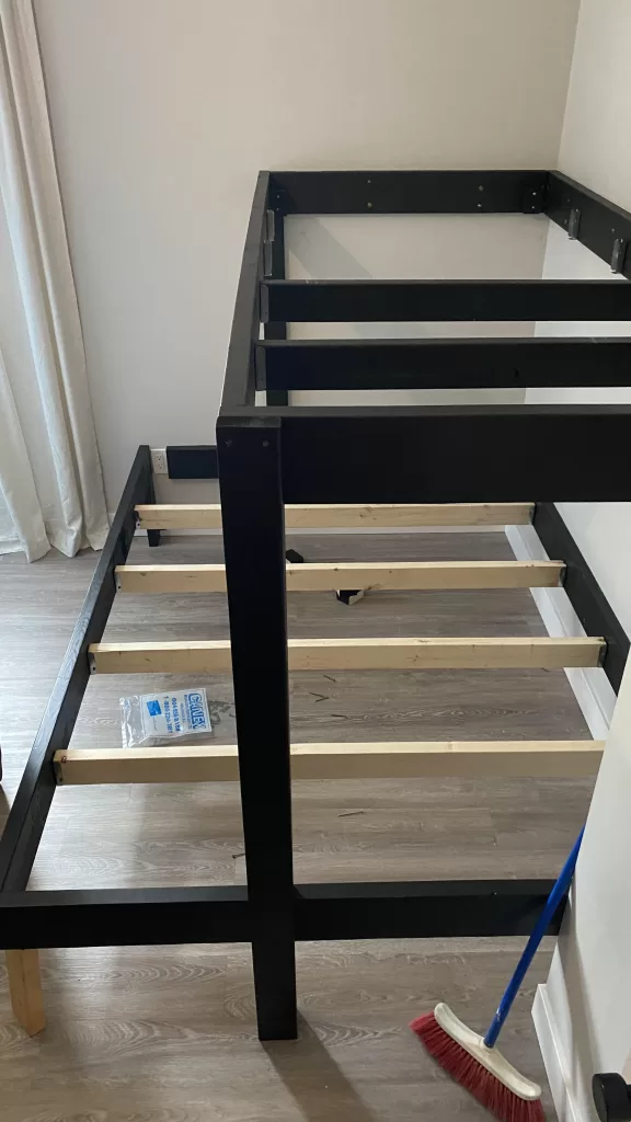
Measure (twice and cut once!) & install your 2x4 cross supports. These slide into the joist hangers, then get screwed in place. We saved paint and time by only painting the top bunk cross supports as you will never see the bottom bunk supports once the plywood and mattress are on top.

STEP 4: INSTALL THE PLYWOOD

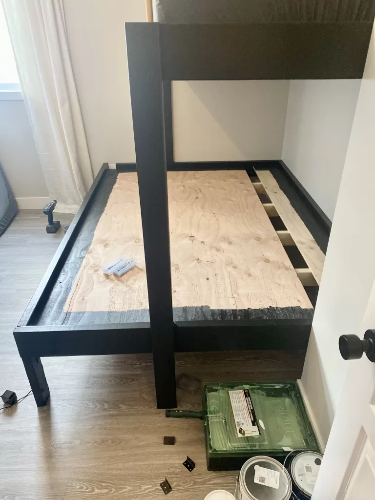
Install your pre-painted plywood on each bunk by screwing the plywood into the cross supports. I am all about saving time, so again to save time & paint, we painted only the perimeter of the visible parts, and the bottom of the sheet going on the top bunk as you will see it from the bottom bunk. A 4x8 sheet doesn't cover the entire width of the bottom bunk so we used a cut off from the top bunk to save on materials. This will not affect support in any way, this thing is literally built like a deck and could withstand an earthquake.

STEP 5: BUILD & INSTALL THE LADDER

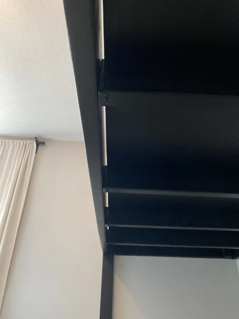
At this point we made some modifications on the fly. My original design of the DIY bunkbed created the illusion of a floating bottom bed, but we felt a little more support was needed and more important than aesthetics. I also changed the safety rail from 2x4's to the round dowel.

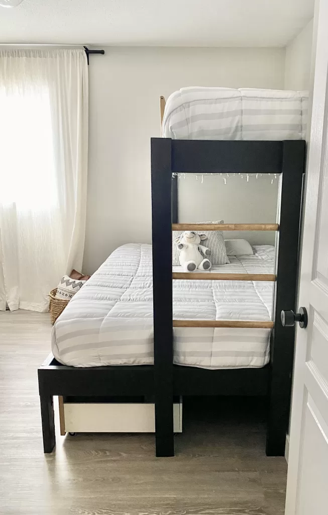
Although the ladder was going to provide most of the support, we decided to add some legs at the outer corners using cut-offs.

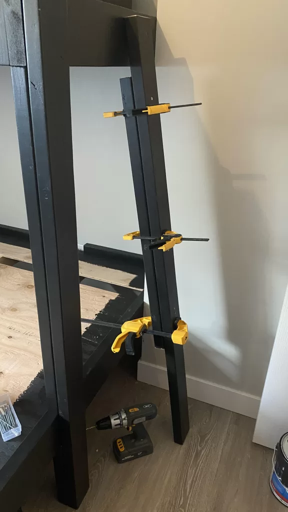
Measure the space between the bottom and top rail, cut two 2x4's to fit. Measure the outside from floor to the top of the top rail, cut two pieces. Assemble your ladder and dry fit it to ensure it fits the space.

Add wood glue between your boards, clamp and screw together. Remove and let dry.

Measure the placement of the ladder rungs, and using the Forstner bit, drill holes to fit the rungs. Install one side of your ladder by screwing it to the outside of the foot boards. Insert glue into the holes, insert the rungs into the holes of the ladder you have attached. Then insert the rungs into the holes of the side of the ladder that you have not yet attached, make snug & and then screw that side of the ladder to the foot boards. Your ladder is complete!! You can start filling holes at this point so you can start on your safety rail while this dries.

STEP 6: BUILD & INSTALL THE SAFETY RAIL

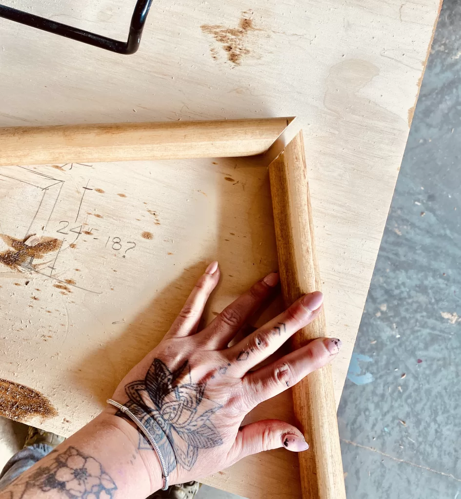
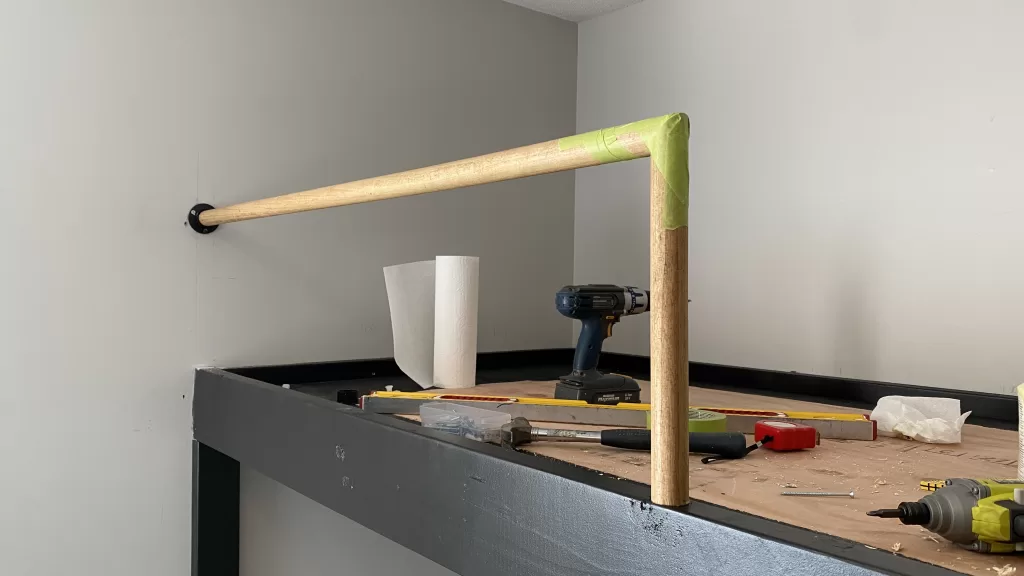
This is where you will need your miter saw. This can be any size you want really, and it will depend on the height of your mattress, so take that into account when measuring.

Make a 45 degree cut using your saw.

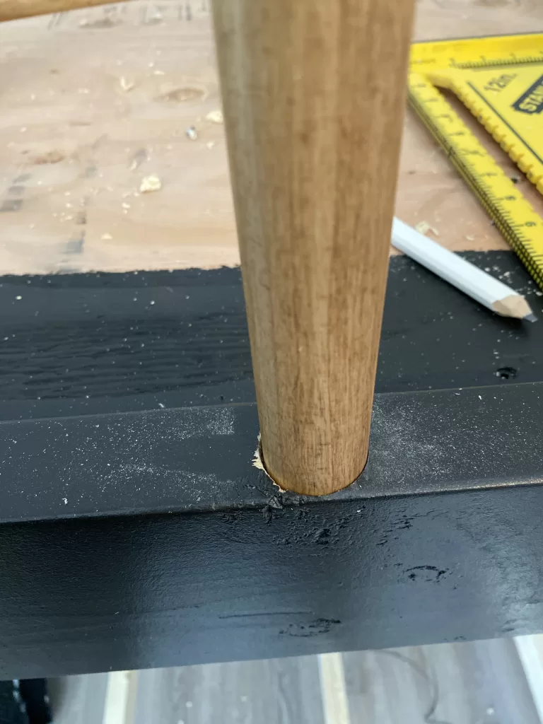
Using your Forstner bit, drill a hole very carefully into the top bunk side rail. You do not have much room for error here!

Place the wall bracket on the wall, and secure into place (you may need drywall supports if you don't hit a stud)

Place glue into the hole on the top rail, install the safety rail and let dry.

While this is drying, fill your holes using wood filler, let dry, sand & paint. The hard part is done, now onto the fun stuff!

STEP 7: STYLE YOUR DIY BUNKBED!

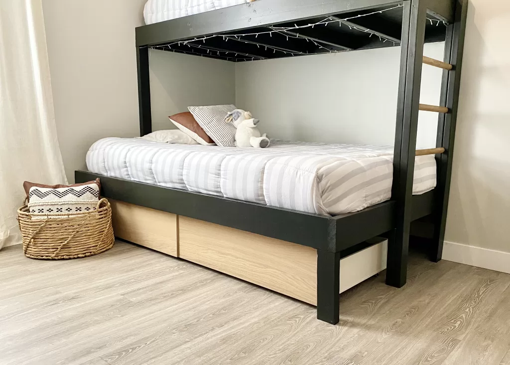
I chose this striped bedding from Amazon and added some twinkle lights to the bottom bunks for our daughters.

We ensured we had 12" under the bottom bunks for MALM underbed storage boxes from IKEA

If you enjoyed this tutorial on building your own DIY bunkbed's , please subscribe to my blog & newsletter for DIY projects, designer tips and resources. Happy DIY'ing!

The Art of Shelf Styling: Elevate Your Home Decor

Shelves are more than just storage spaces; they are opportunities for creativity and self-expression to elevate your home decor. Whether you have a bookshelf, floating shelves, or a built-in unit, shelf styling is an art that can transform an ordinary space into a visually captivating and well-curated display. In this blog, we will explore the art of shelf styling and provide you with tips and inspiration to curate beautiful and personalized vignettes that are both visually appealing and purposeful.

DESIGN: STEPHANIE HILTON DESIGN (view project HERE)

9 TIPS TO STYLE SHELVES LIKE A DESIGNER

1 / DECLUTTER & EDIT

Before embarking on your shelf styling journey, take a moment to declutter and edit your belongings. Clear the shelves of unnecessary items and only keep objects that are meaningful, beautiful, or functional. This step will provide a clean canvas for your styling efforts and ensure that your curated display doesn't appear cluttered or overwhelming. Before diving into the world of shelf styling, begin by clearing out the clutter and creating a blank canvas. Remove all items from the shelves and give them a thorough cleaning. This step allows you to approach the styling process with a fresh perspective.

DESIGN: STEPHANIE HILTON DESIGN (view project HERE)

2 / PLAY WITH BALANCE & SYMMETRY

Creating a visually appealing display involves finding balance and symmetry. Start by dividing your shelves into imaginary vertical or horizontal sections, and aim for an equal distribution of visual weight. For example, if you place a large vase on one side, balance it with a stack of books or a group of smaller objects on the opposite side. Symmetry can be achieved by mirroring objects or creating a visually pleasing rhythm with repeated elements.   Place taller or larger items towards the edges of the shelves and gradually decrease the height as you move towards the center. Balance out different shapes, textures, and colors to maintain a harmonious composition.

DESIGN: STEPHANIE HILTON DESIGN (view project HERE)

3 / LAYERING, VARYING HEIGHTS & GROUPING

To add depth and visual interest, experiment with layering objects on your shelves. Place larger items at the back and smaller items in front to create depth and dimension. Varying the heights of objects will prevent a monotonous arrangement and keep the eye engaged. Use risers or books to elevate shorter objects and create a dynamic composition. Layering objects adds depth and dimension to your shelves. Play with different heights, textures, and sizes to create visual intrigue. Group similar items together, such as books or vases, to create a cohesive look. Experiment with varying angles and orientations to add movement and a dynamic feel to the arrangement.

DESIGN: STEPHANIE HILTON DESIGN (view project HERE)

4 / MIX TEXTURES, COLOURS & MATERIALS

One of the key elements of successful shelf styling is the thoughtful selection and arrangement of objects with different textures, colors, and materials. Combining various textures, such as rough ceramics, smooth glass, or woven baskets, adds tactile interest. Consider incorporating different materials, like wood, metal, or stone, to introduce visual diversity. Inject pops of color through books, vases, greenery or decorative objects that complement or contrast with the overall color scheme of the room.

DESIGN: STEPHANIE HILTON DESIGN (view project HERE)

5 / INCORPORATE GREENERY & NATURAL ELEMENTS

Bringing nature indoors can breathe life into your shelf styling. Add potted plants or fresh flowers to introduce a vibrant touch of greenery. Natural elements such as shells, coral, or driftwood can add an organic and beachy feel. These elements not only infuse freshness and vitality but also create a sense of harmony between the natural world and your home environment.

DESIGN: STEPHANIE HILTON DESIGN (view project HERE)

6 / MAKE IT PERSONAL

Shelf styling is an opportunity to showcase your personality and display personal mementos or collections. Incorporate items that hold sentimental value or reflect your hobbies and interests. Vintage cameras, travel souvenirs, pottery, family photographs, or treasured heirlooms can all become focal points of your shelf display, sparking conversations and adding a personal touch.

DESIGN: STEPHANIE HILTON DESIGN (view project HERE)

7 / CURATE WITH INTENTION

Avoid the temptation to overcrowd your shelves with too many items. Embrace the concept of minimalism and curate your display with intention. Negative space is just as important as the objects themselves, allowing the eye to rest and appreciate each item. Be selective and change the arrangement periodically to keep the display fresh and engaging.

8 / PAY ATTENTION TO NEGATIVE SPACE

Don't overcrowd your shelves. Negative space plays an important role in creating a visually pleasing arrangement. Allow some breathing room between items to highlight the objects and prevent the shelves from feeling cluttered. Embrace simplicity and let the empty spaces enhance the overall composition.

DESIGN: STEPHANIE HILTON DESIGN (view project HERE)

9 / EDIT & REASSES

Styling shelves is an ongoing process. Take a step back and evaluate your arrangement periodically. Edit and remove items that no longer fit the desired aesthetic or purpose. Embrace the freedom to experiment and evolve your shelf styling as your tastes and preferences change over time.

Shelf styling is an art form that allows you to showcase your creativity and personality. By following these tips and incorporating your unique style, you can transform your shelves into captivating displays that not only elevate the aesthetics of your space but also reflect your individuality. Remember, there are no hard and fast rules, so have fun, embrace your creativity, and let your shelves tell your story.

If you are still stuck and styling is just not your thing,  contact me and we can discuss how I can help you with furnishing & styling your home.

Pottery Barn and McGee & Co DIY dupes

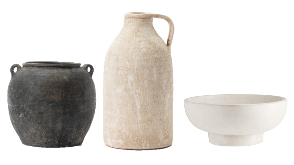
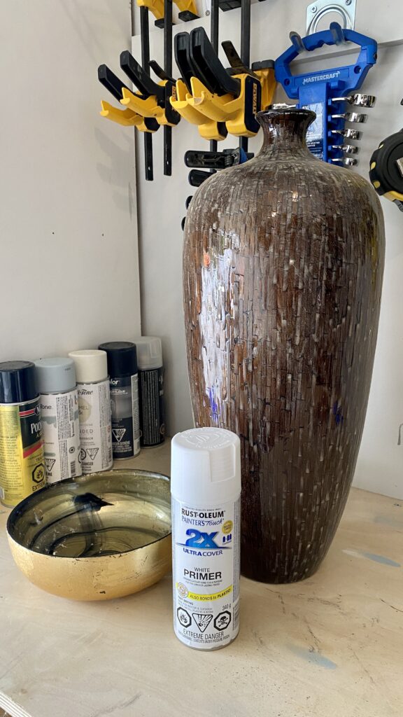
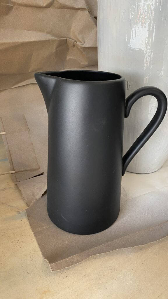
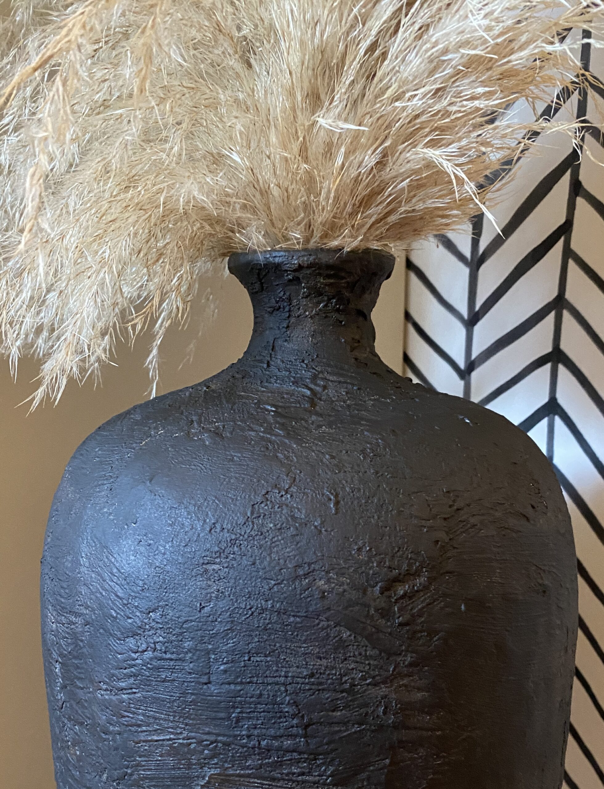
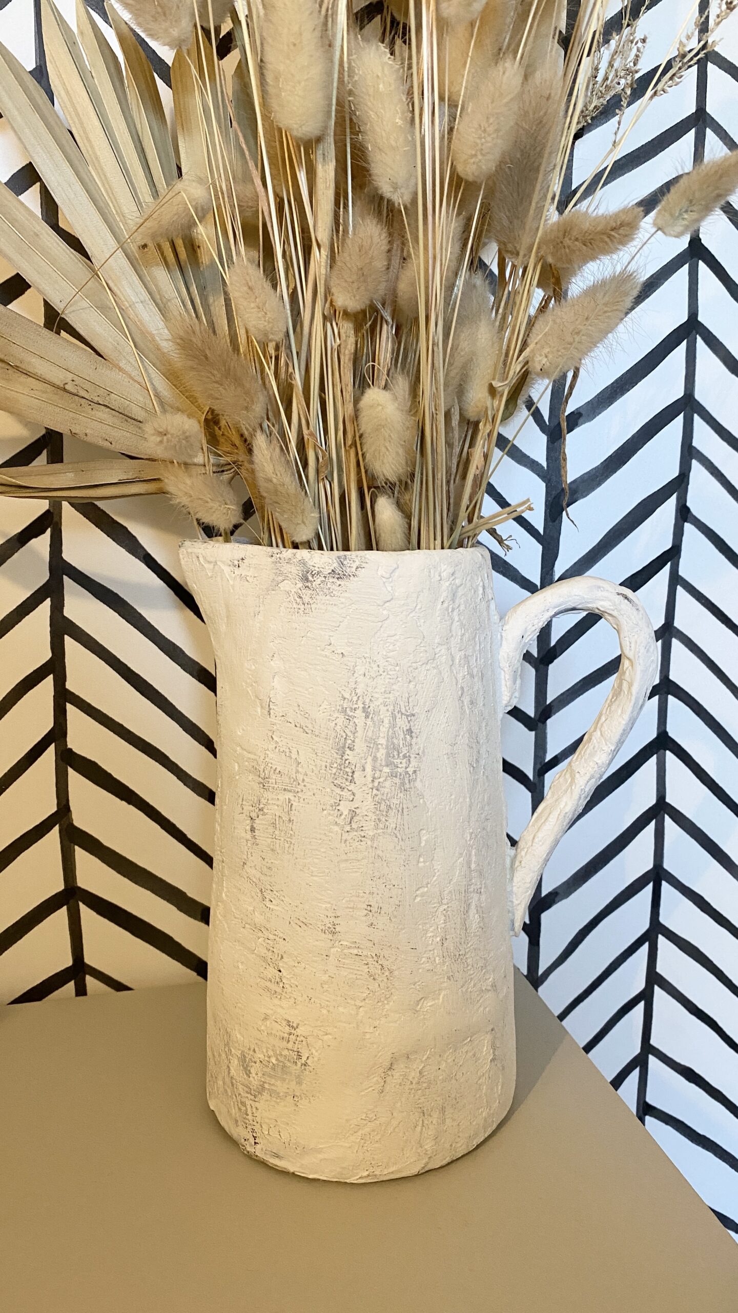
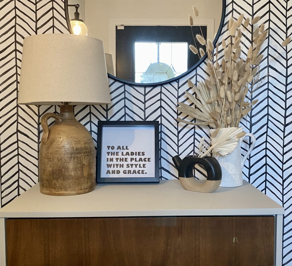
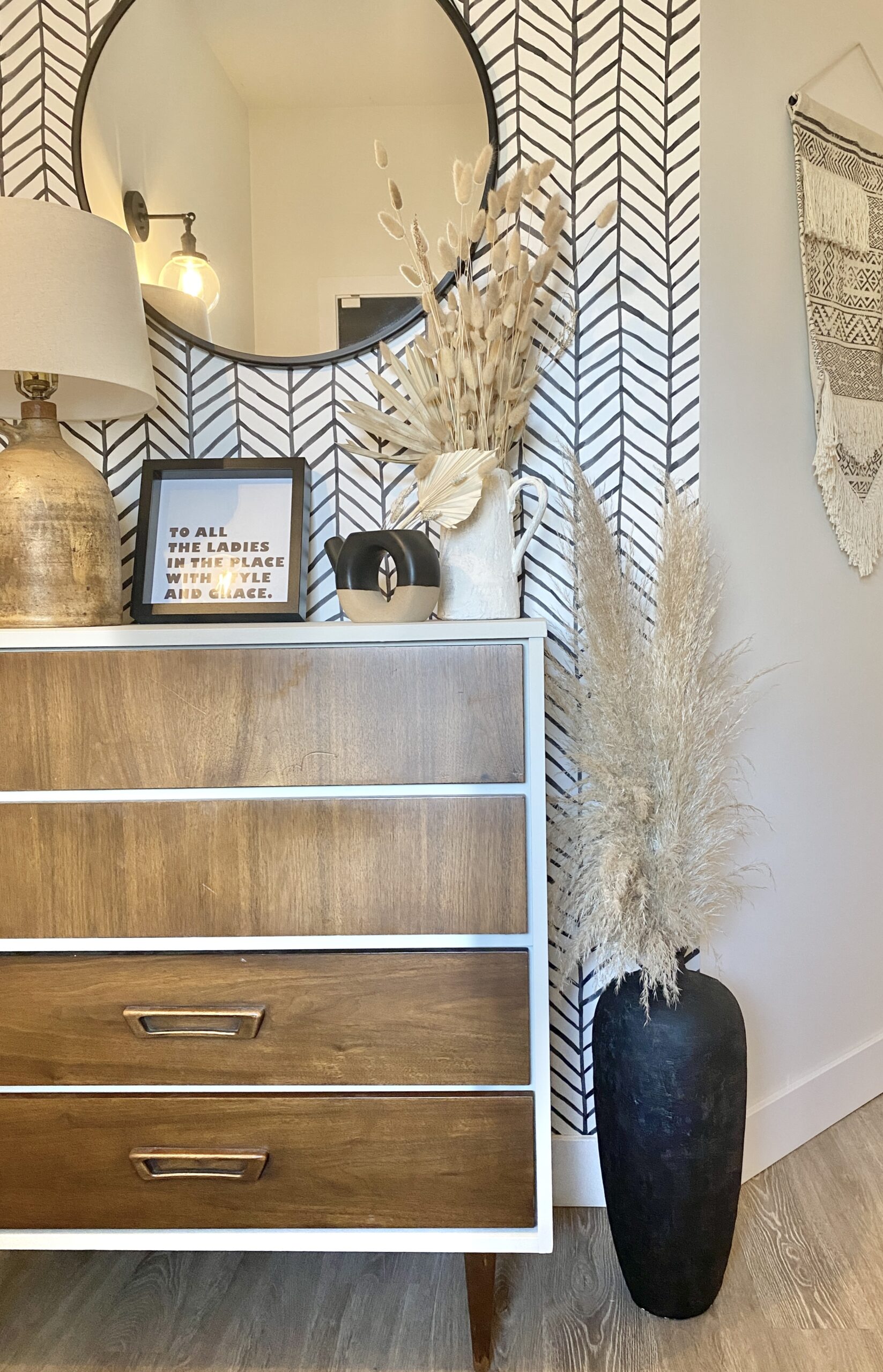
I love the aged, old world look of Pottery Barn, McGee & Co and Crate & Barrel accessories, but the price tags...not so much. I am a big fan of texture, neutrals, DIY and upcycling, so I knew there was a way to copy these looks for a fraction of the price using a few simple supplies. I bought 3 floor vases from Facebook Marketplace for $20 and had an old gold bowl and black pitcher laying around that I no longer used, but I loved their shapes. I will walk you through step by step how to achieve this designer look on a thrift budget. (PS. I also made the little riser in the image above ^^^ )

THE INSPO:

Vessels from: Pottery Barn and McGee & Co

MATERIALS YOU NEED:

STEP 1: PREP YOUR VESSEL

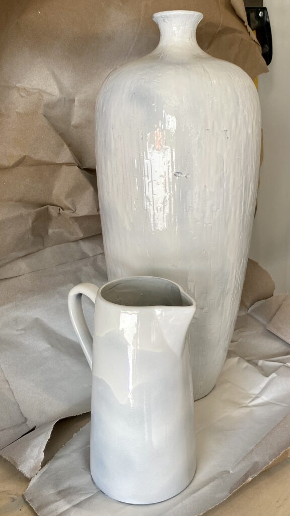
I gave the vase a light sand because it was very glazed. Feel free to skip this step if your vessel is not glazed. I then washed them in soap and water to remove any dust or oil, and let dry completely. I sprayed them with a fast drying primer (do not worry about this being pretty, it is going to be covered up anyways). Let the primer cure before moving on to the next step.

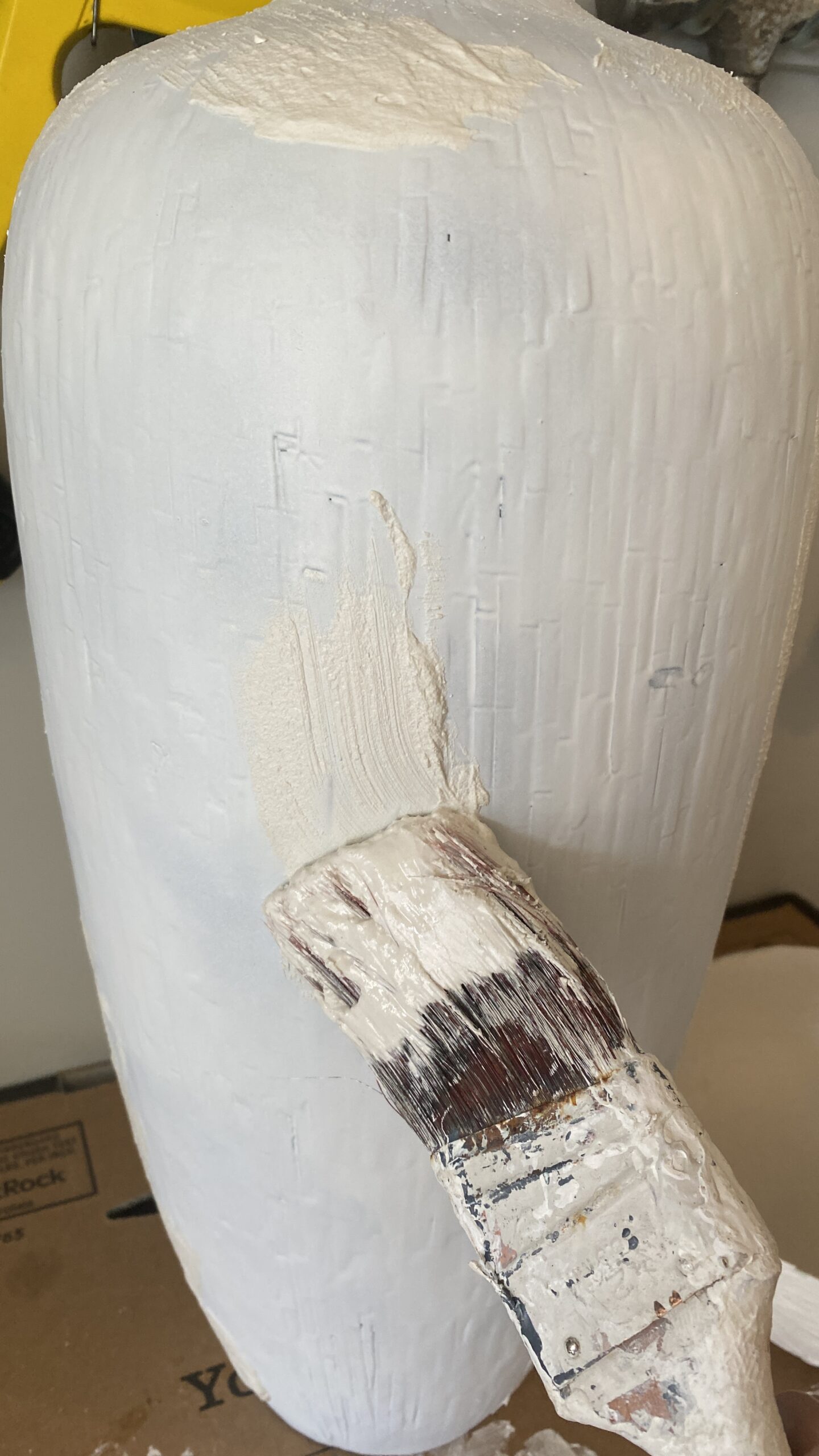
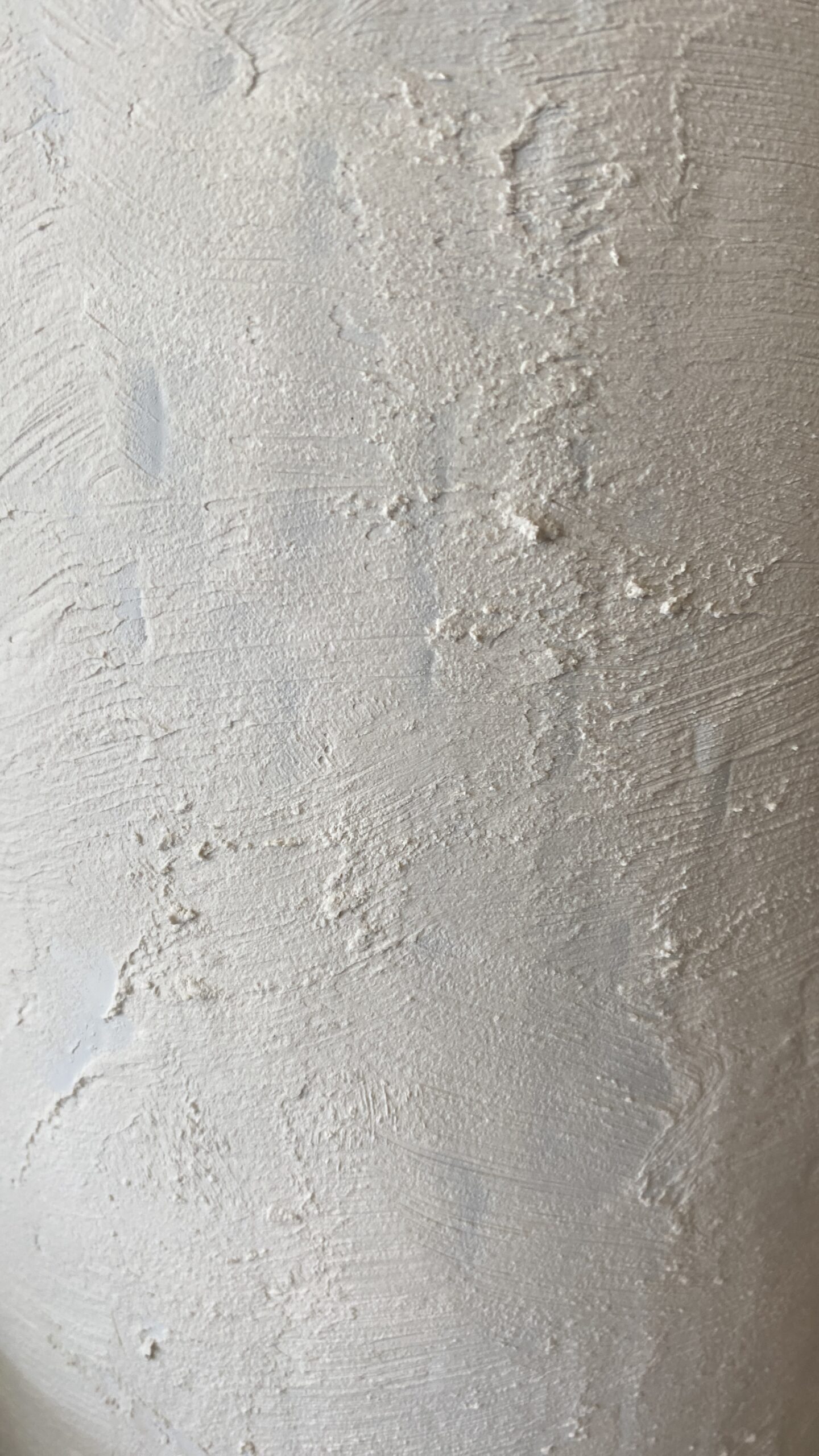
STEP 2: APPLY PLASTER OF PARIS

If you haven't worked with Plaster of Paris before, know that it dries very quickly, you only have about 10 minutes to work with it from the time you mix it with water. Have your workspace & vessels ready before mixing so you can get to work right away. Follow the instructions on the box, I like to mix it so it is the consistency of concrete. Again, this does not have to be pretty. You are going for a rough, worn look. Play with different brushes, trowels, putty knives etc. I like to use the putty know to apply, then use a brush to create my texture. Let dry.

STEP 3: PAINT

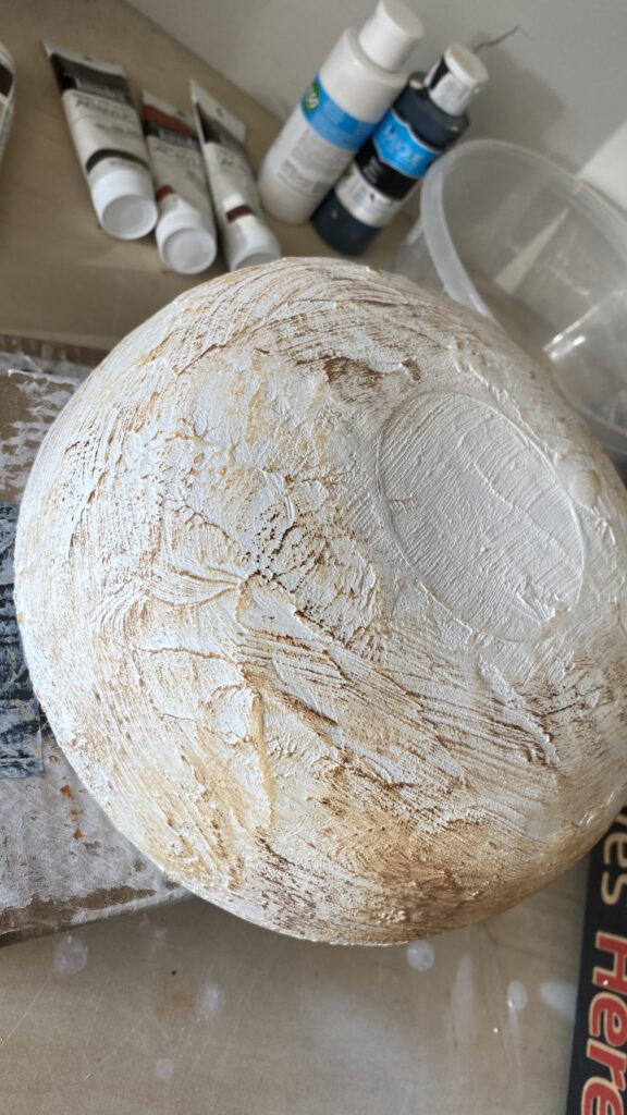
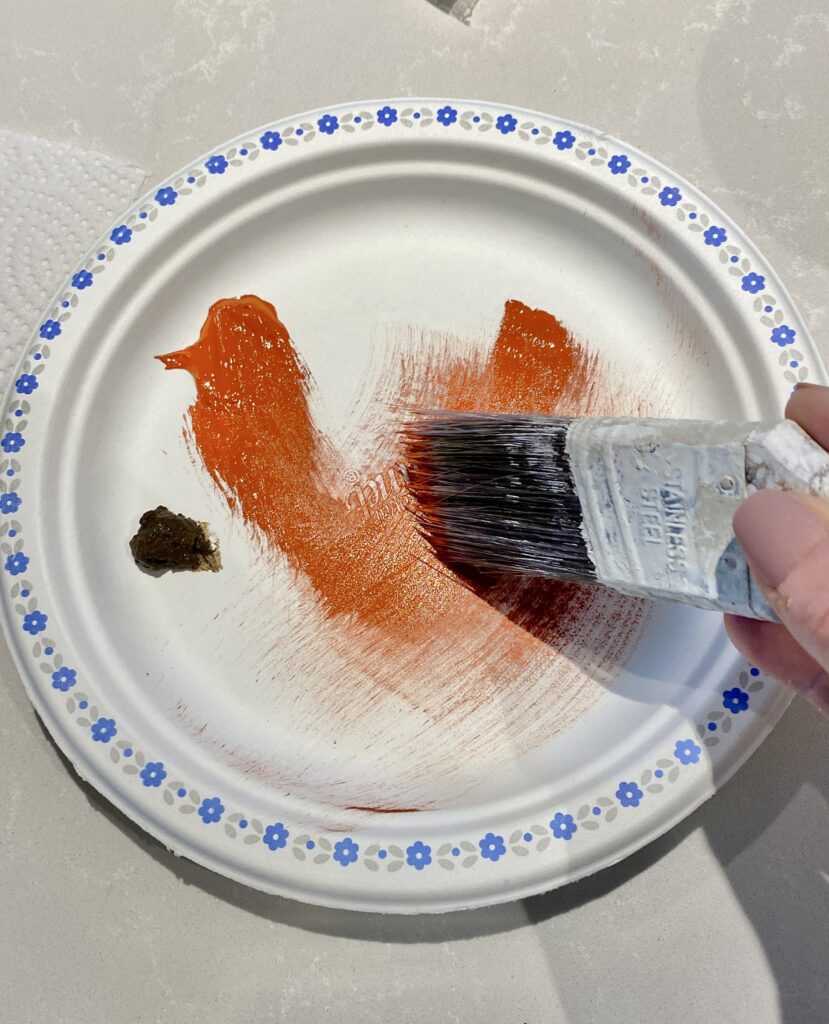
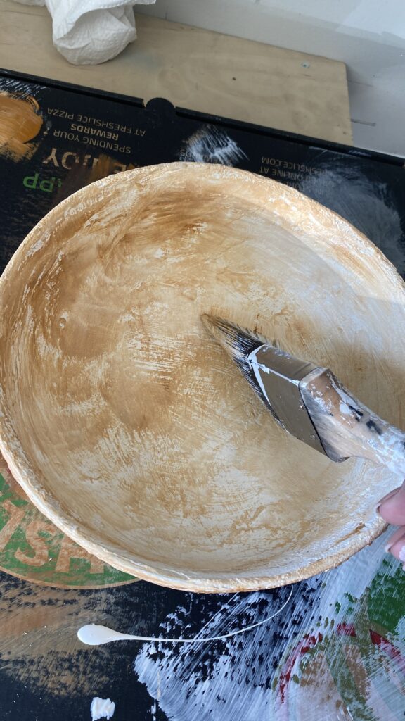
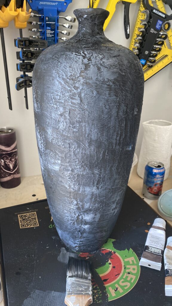
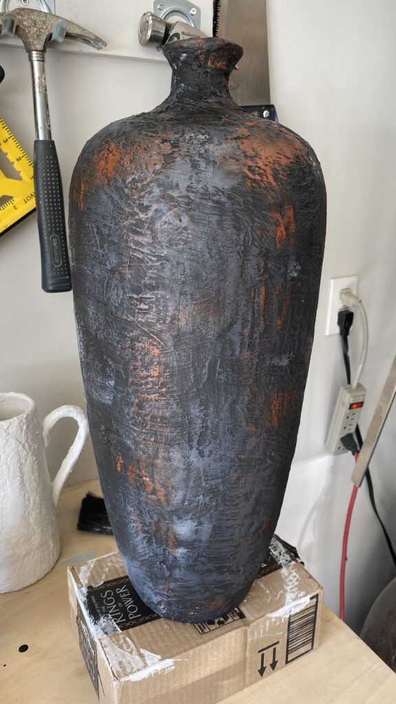
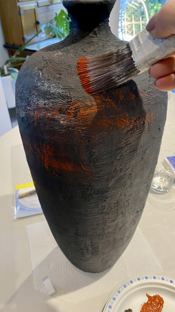
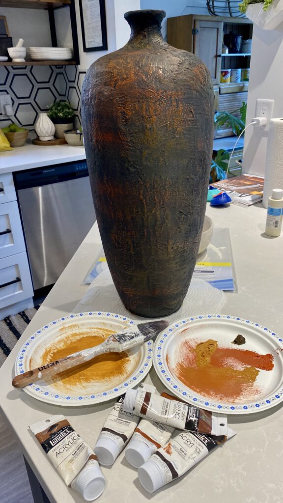
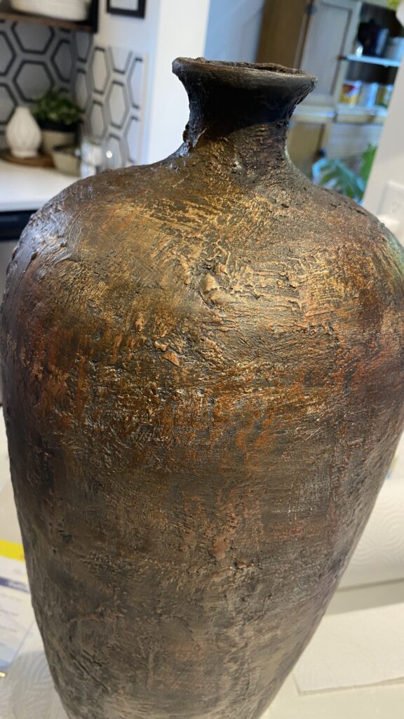
This is where the fun starts. I had 3 pieces and 3 different looks I was going for. I applied a black base coat to the large floor vase, and cream base on the bowl and pitcher, followed with some burnt umber and browns to give it a rustic look. I applied the top colors using a dry brush technique. You do this by putting a small amount of paint on your brush, wiping off the excess and lighting brushing your vessel.

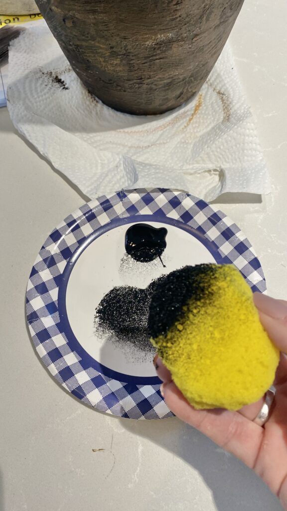
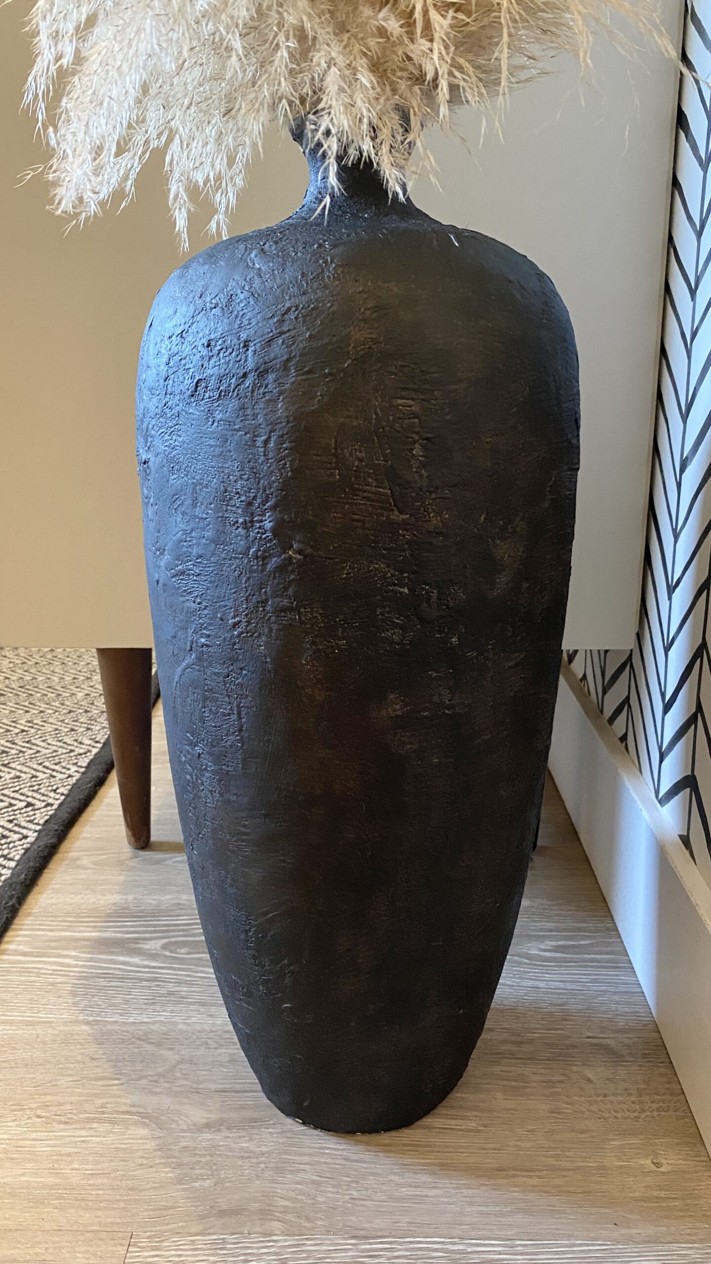
After letting them dry, I applied more black to the vase using a sponge, and more cream to the bowl and pitcher until I got my desired color. Don't be afraid to layer colors over and over again, there is no right or wrong way. You can always layer again if you don't get the look you are going for. There is honestly no way to mess this up.

THE RESULTS ARE IN!

I am pretty happy with these results, what do you think? My total cost for this project was about $10. The vase was $7 (I got 3 for $20), the bowl and pitcher I had already, the dollar store paints I also had but I accounted for a couple dollars, and the Plaster of Paris was $8 but I have a ton left for more projects. Not too shabby considering the originals are $100-200 each.

If you enjoyed this tutorial, please subscribe to my blog & newsletter for DIY projects, designer tips and resources. Happy DIY'ing!

Easy Fall Decorating tips

Fall decorating doesn't have to be over the top or tacky. It is easy to accomplish a tastefully decorated home for fall without going to the extreme. If done thoughtfully, your fall decor can be used throughout the year.

Photo credit: Bless This Nest

4 TIPS FOR TASTEFUL FALL DECORATING

1 – USE NEUTRAL COLOURS

Using neutral colours in any decorating scheme creates a calm and peaceful space. Use muted and softer tones of fall colours such as terracotta, beiges, mushroom, cream etc. Adding texture creates a cozy feel as well. You can add in some texture with knitted throw blankets, toss cushions, and décor items such as seagrass trays & baskets, fabric pumpkins, Pampas grass or bunny tails.

2 - LESS IS MORE

It is not necessary to have pumpkins all over your house (unless that is your thing of course, go for it) to decorate for fall. Injecting intentionally placed fall décor like pumpkins, pine cones, and other items from nature into your existing décor adds a touch of fall, but doesn't make you feel like you are in the middle of a pumpkin patch.

3 - WELCOME YOUR GUESTS

Your front door and entryway are the first impressions to your guests. Large flowers in pots or baskets, pumpkins & simple wreaths create a welcoming feel. If pumpkins aren't your thing, use some burnt orange, and other earth tone flowers combined with neutrals for a fall feel. Don't be afraid to add a little black, it is Halloween season afterall!

4 -  DRIED FLORALS & BRANCHES ARE YOUR FRIEND

If you are anything like me, plants don't survive to long in my home (other than snake plants and select cacti). So, I have resorted to dried florals and branches. Not only do they last forever, they are easily interchangeable through the seasons. You can add in colours of the season like browns & oranges during fall, red & whites during Christmas, and green in the spring.

Some of my favorites to use are pampas grass, bunny tails, cotton, eucalyptus, palm leaves, lavender, and twigs. Arranging them in textured vessels and amber bottle's will add warmth to your fall décor.

Did you find these tips helpful? Subscribe to our blog & newsletter to have them delivered to your inbox.

Follow us on Pinterest for more Fall Decorating inspiration and other Interior Design tips & inspo.

If you want to discuss how I can help you with interior styling, your upcoming renovation or new-build, reach out below and book a discovery call with me. I’d love to help you create the home you’re dreaming of.

Stephanie Hilton Design is a boutique full-scale Interior Design studio based in the Fraser Valley, BC.

It is my joy to create spaces that are not only timeless, but thoughtful and functional. I believe there is no place on earth more important for your relationships and wellbeing than home.

Please reach out if you have a project you would like to discuss, I love to talk design!